
Championing community through coworking spaces
Project Background
Sparrow Cowork is Edmonton's community of entrepreneurs. Their neighbourhood locations offers freelancers and small businesses the infrastructure, community, and space they need to grow. Sparrow's brand and visual identity system is designed to reflect the warmth of the spaces themselves and the community that they foster.
*This project was done at Sonder Creative.
Project Scope
Brand Creation and Visual Identity System
Website Design (UI + UX)
Wordpress Development
Online Marketing
My Contributions
Creative Direction
Brand Creation and Visual Identity System
Opportunity
Showcasing the value behind community and connections when sharing space
Coworking is a competitive category where most spaces compete on trendy amenities and price per square foot of office space. Sparrow's founders knew there was something more meaningful to offer – real community, in desirable neighbourhoods, built around the specific needs of local entrepreneurs. It’s an approach that’s harder to show, but far more compelling to the right audience.
The brand challenge was to express that community-first philosophy in a visual identity that felt warm and human without losing the professional credibility that business owners expect from a workspace partner. And the digital challenge was to reach the right people (solo founders, growing teams, remote workers) looking for something more than a generic cowork pass and give them a compelling reason to book a tour.
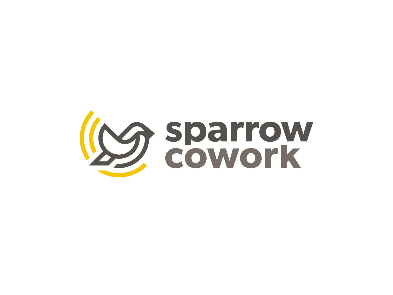

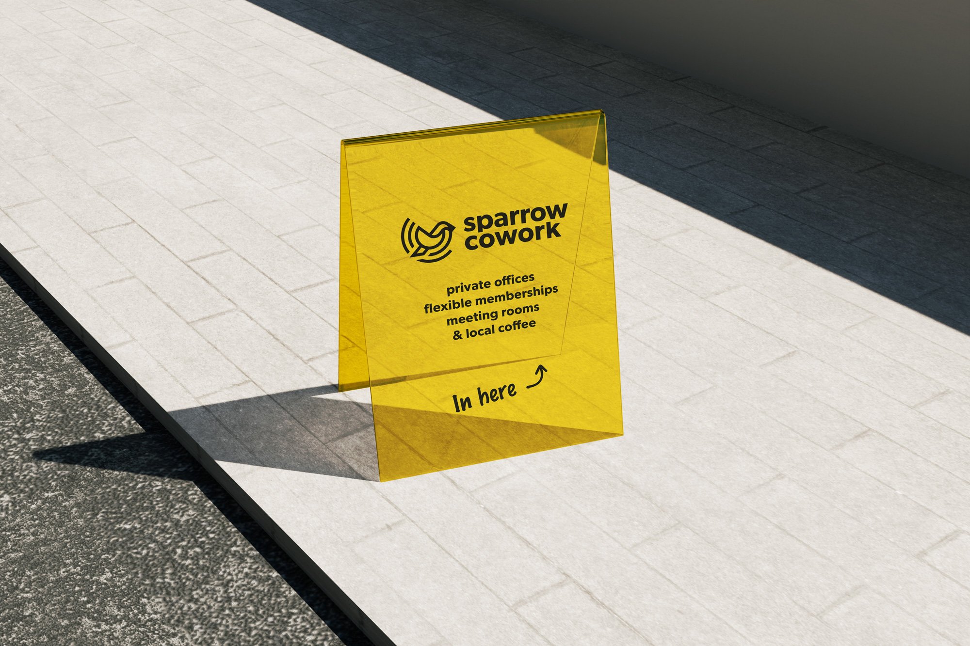
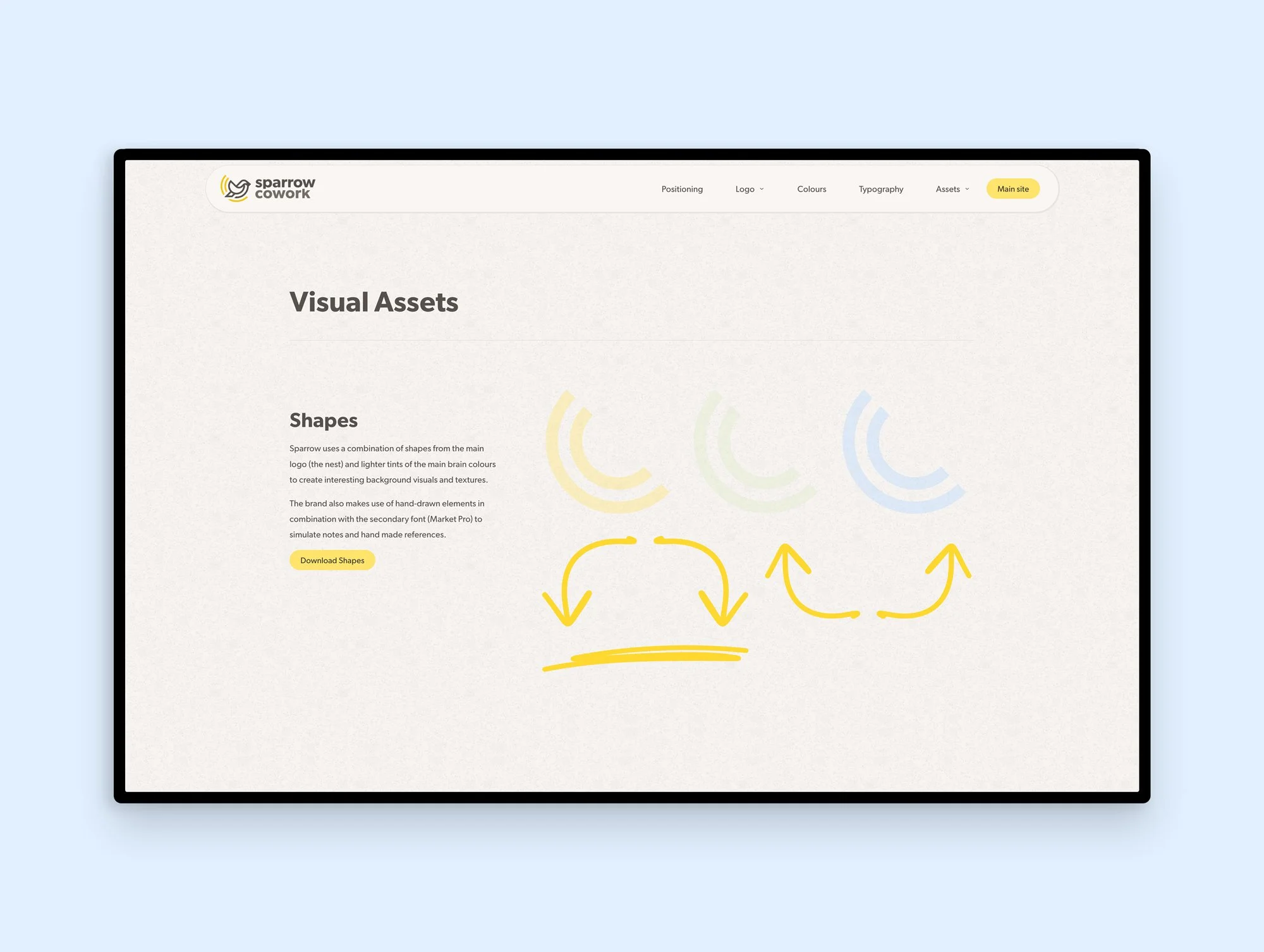
The metaphor within name “Sparrow” carries through different branches of the brand including the visual identity. The swooping, curved brand mark became a direct expression of connection and representing the “cowork” as a nest and the “sparrow” as the individuals that make up a community. The visual identity centres on a warm, energetic yellow supported by soft, natural secondary colours.
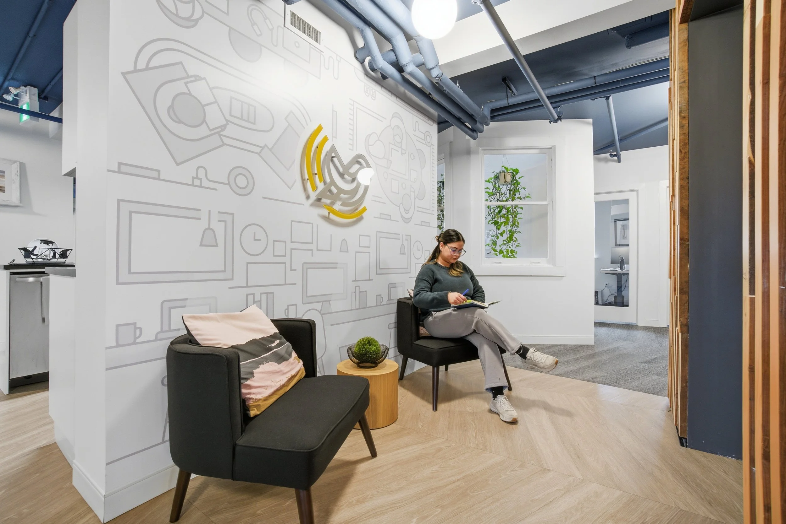
Branded wall mural illustrated for the Gibbard Block location
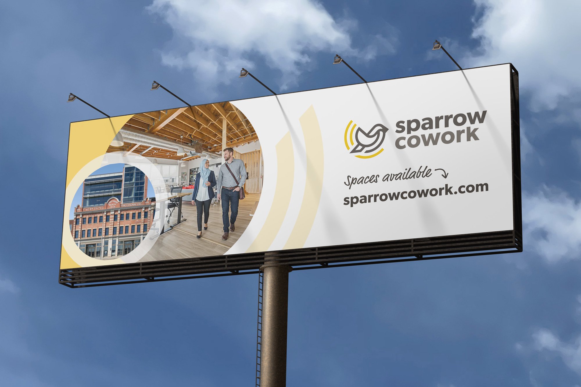
Imagery features the real spaces and connections between people
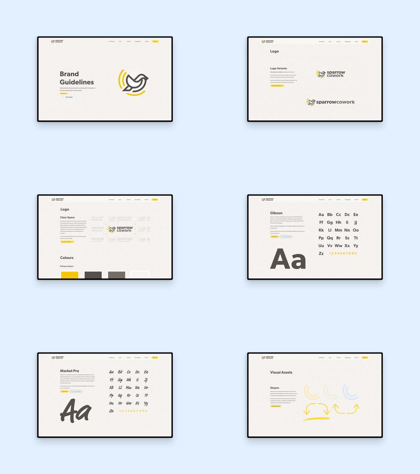
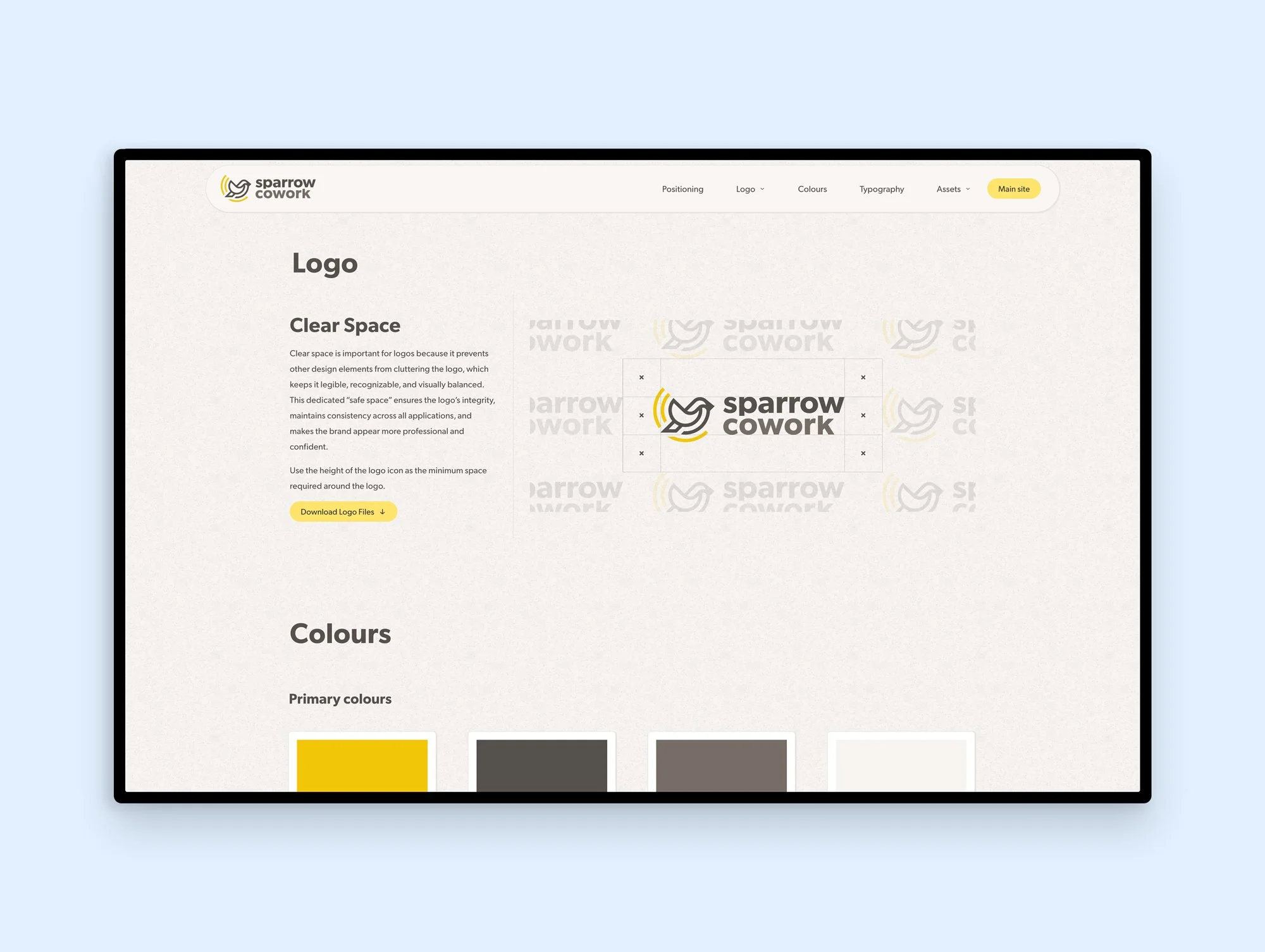
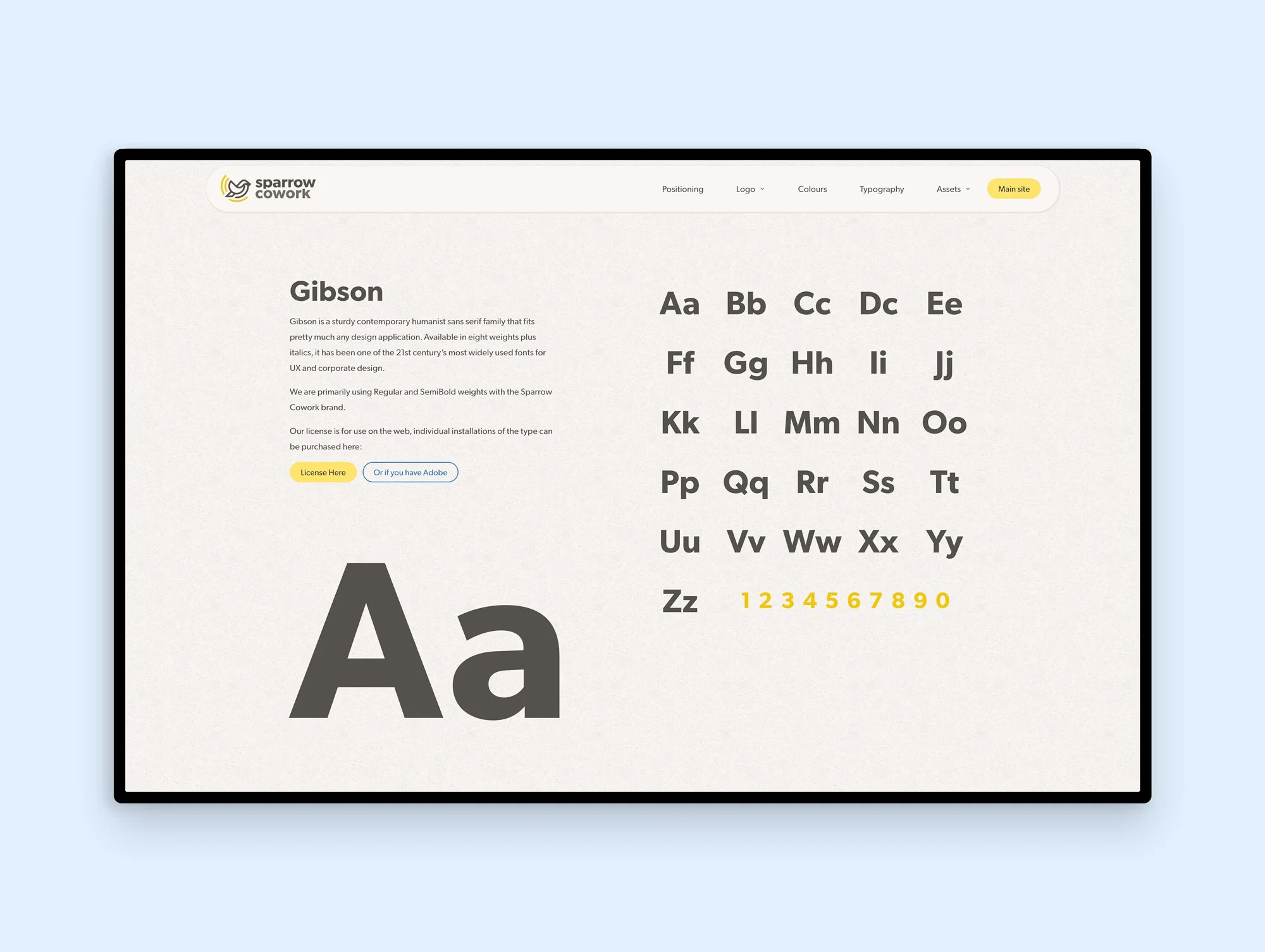
Digital brand guidelines built into the website for easy access to assets and downloads.
Insights
Community is at the heart of Sparrow Cowork’s offerings and differentation in the market
We recognized neighbourhood identity as a competitive advantage. Being rooted in distinct Edmonton neighbourhoods of Jasper Avenue, Highlands, and Westmount is part of what makes Sparrow different. Members don't just get a desk; they get access to the amenities, restaurants, and character of the neighbourhood around them.
Professional credibility and warmth are not opposites.The cowork audience wants a serious workspace but they also want to feel good about where they spend their days. Sparrow's colour palette, organic (yet structured) brand mark, and conversational tone walk the line between professional and genuinely inviting.
Community content outperforms promotional content. Posts featuring member stories, neighbourhood highlights, and behind-the-scenes moments can outperform promotional posts about pricing and amenities. The most effective Sparrow content feels like it comes from a community, because it does. This insight shaped the content strategy.
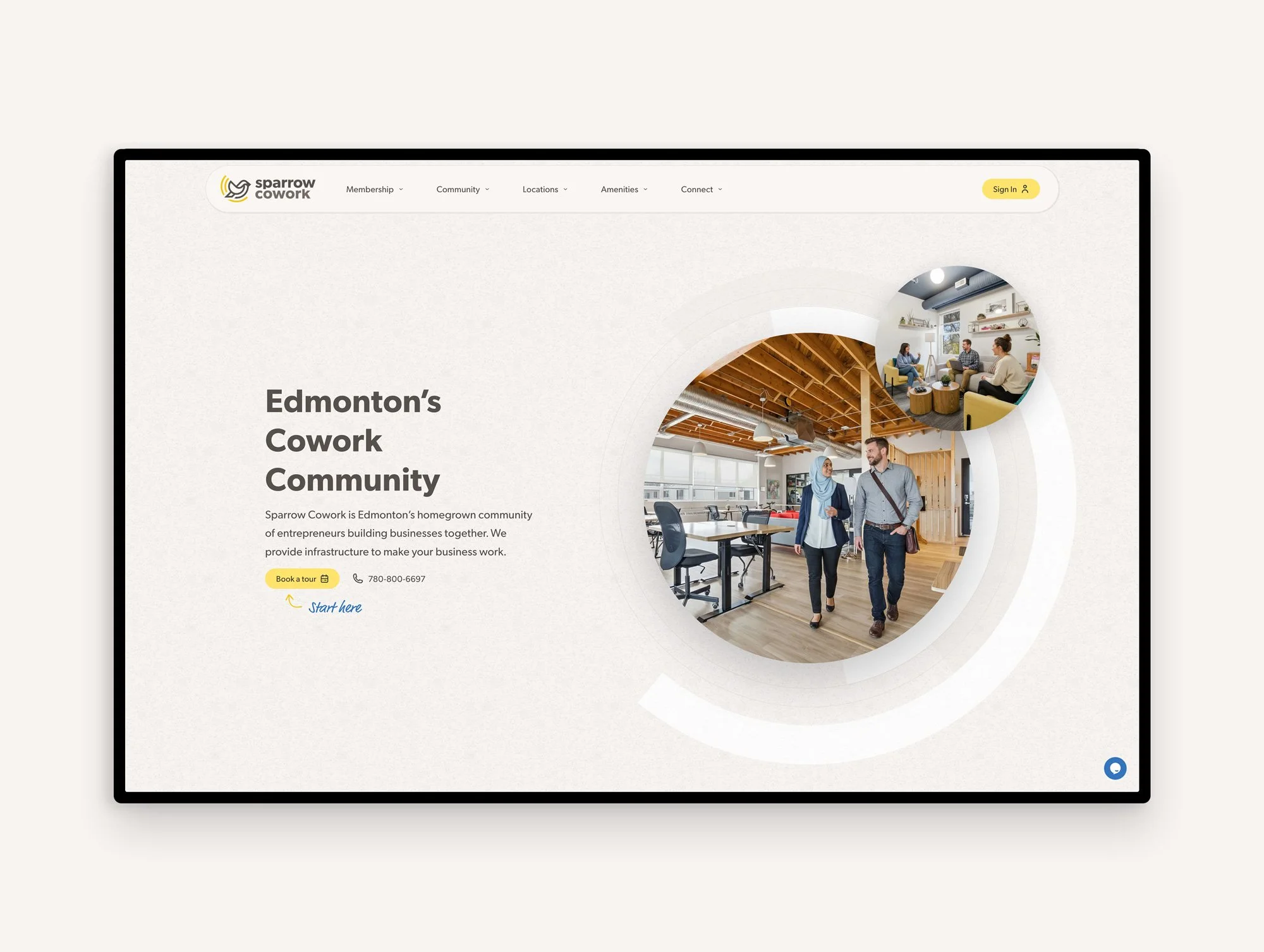
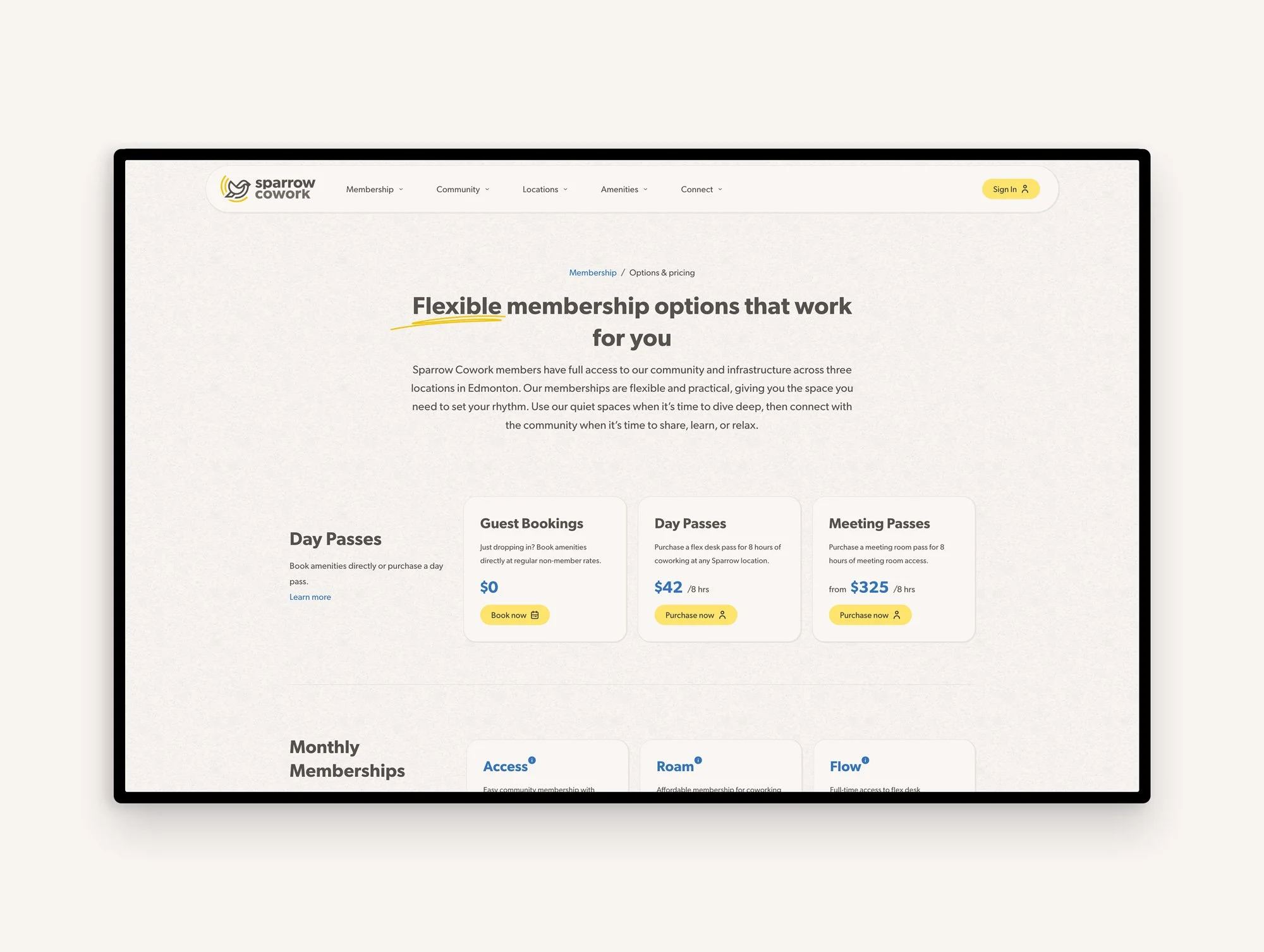
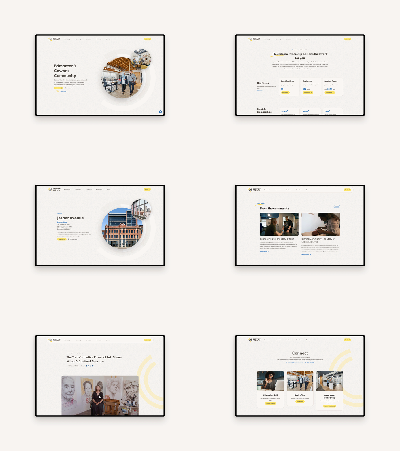
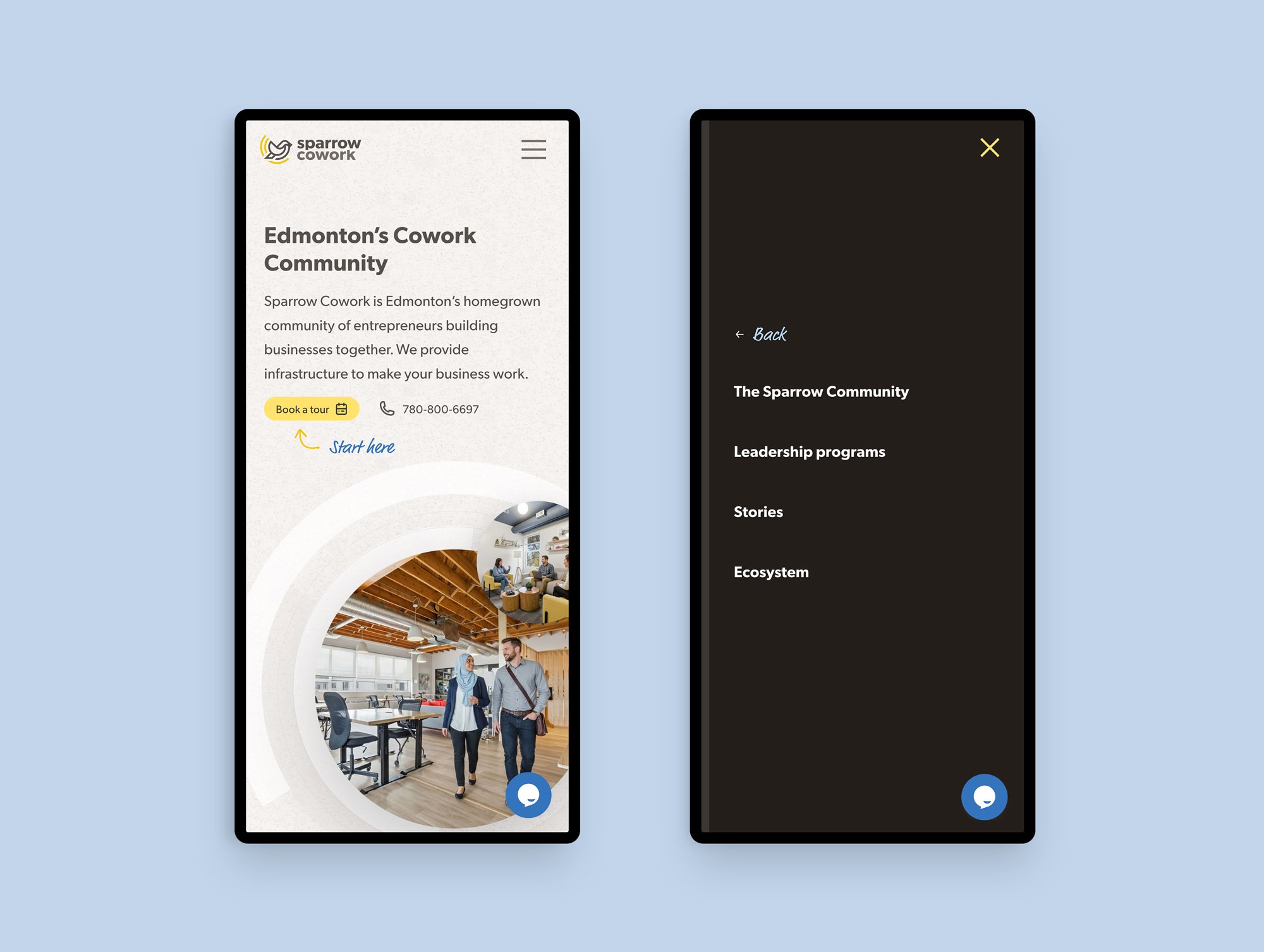
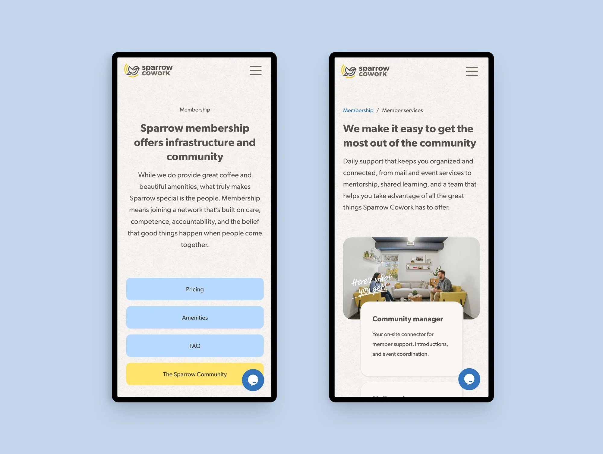
The typography is clean and readable, designed for the practical communication that a membership-based business requires, while being warm enough to never feel corporate. The website gives prospective members a window into the space before booking a tour. Location pages on the website highlight the specific character of each neighbourhood, including the amenities nearby, the feel of the space, and the type of community at the location. *The website was designed by a coworker at Sonder Creative.
Results
The finished work is a brand and digital presence that communicates Sparrow isn’t just a workspace, but a community worth joining.
The visual identity communicates community, warmth, and professional credibility simultaneously, differentiating in a category often lead with specs and pricing.
The website is designed to do three things well: communicate the community and warmth of the brand, provide practical information for people exploring membership, and make it effortless to take the next step of booking a tour, scheduling a call, or grabbing a day pass.
After launch, we continued as Sparrow's digital marketing partner. The goal is building an audience of entrepreneurs and professionals who feel connected to Sparrow before they even walk through the door.
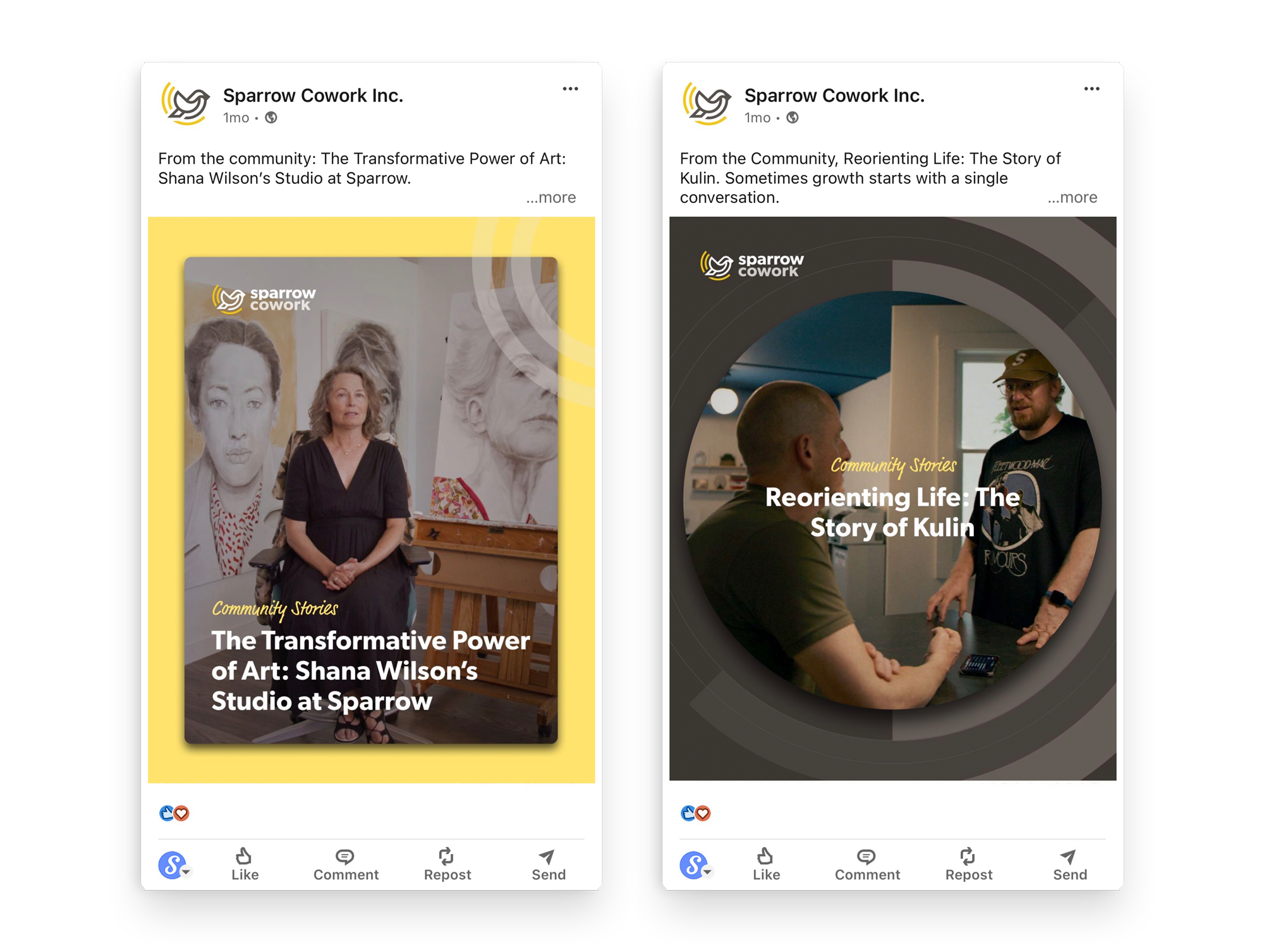
Part of the content strategy is featuring the real stories of the Sparrow community.