Creating a venue for lasting memories in the heart of downtown Edmonton
Project Background
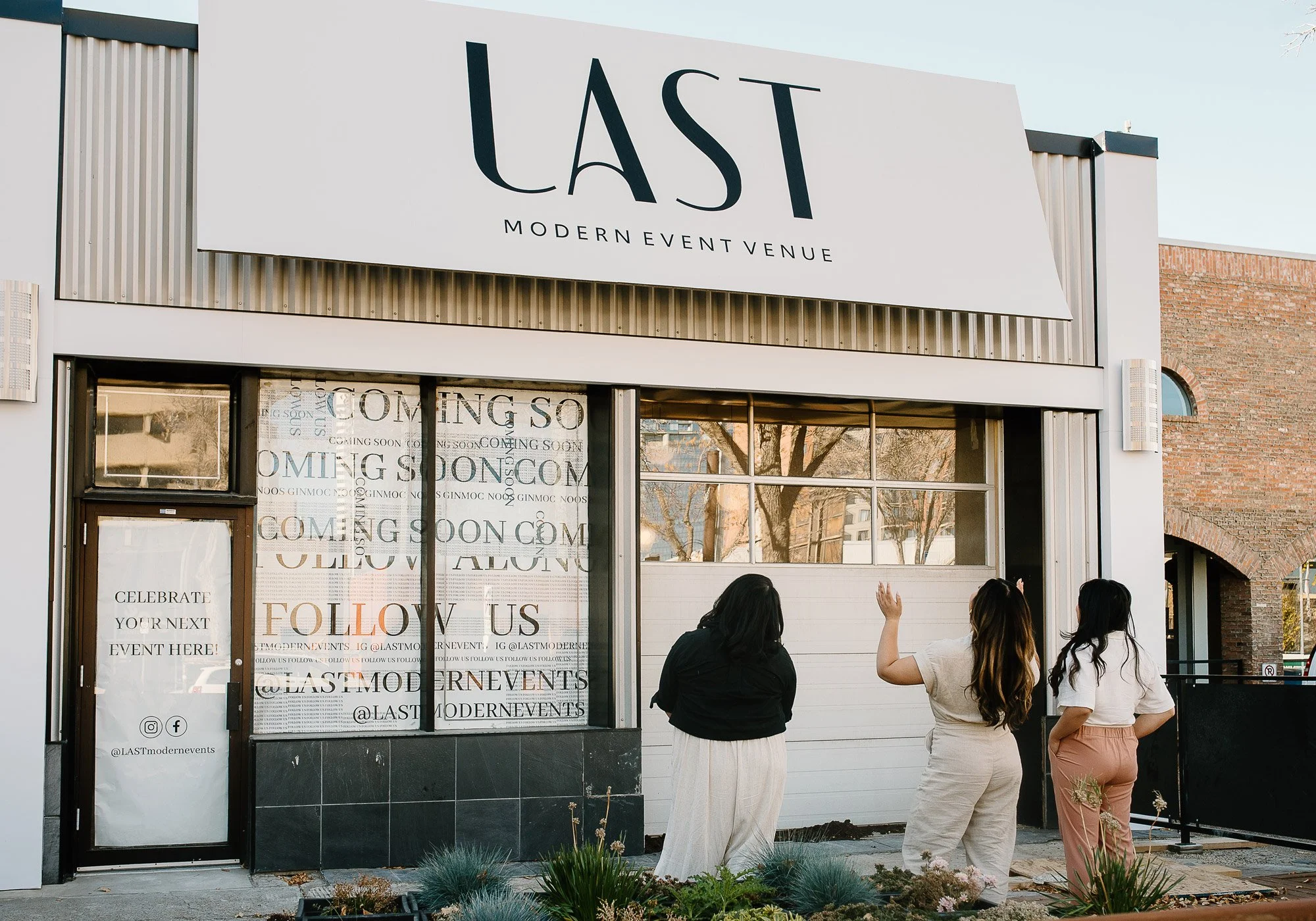
LAST Modern Event Venue came to us as an idea with a vision: a modern, intimate event space in central Edmonton that would feel different from every industrial loft and exposed-brick venue in the city. Founded by Lucy, Anita, and Sarah, LAST was conceived as a warm, elevated canvas, beautifully designed, thoughtfully finished, and genuinely personal.
*This project was done at Sonder Creative.
Project Scope
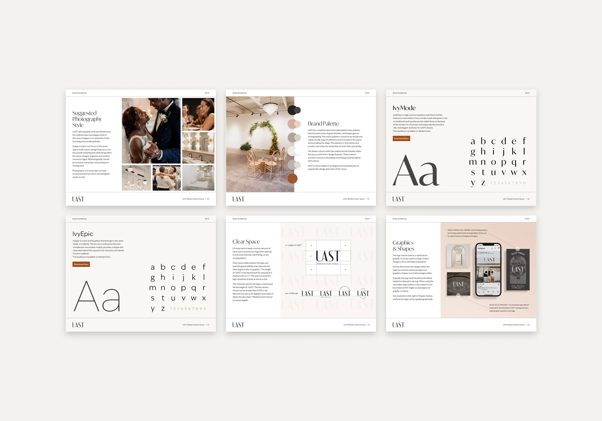
Brand Creation and Visual Identity System
Website Design (UI + UX)
Wordpress Development
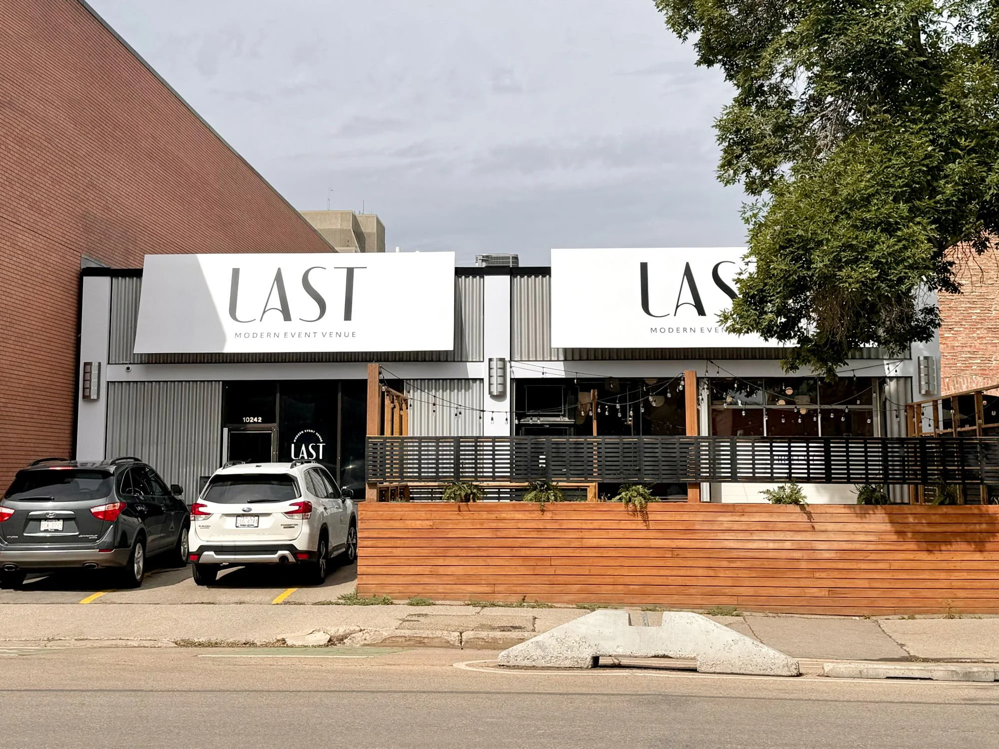
Signage Design
Online Marketing
My Contributions
Creative Direction and Lead Designer
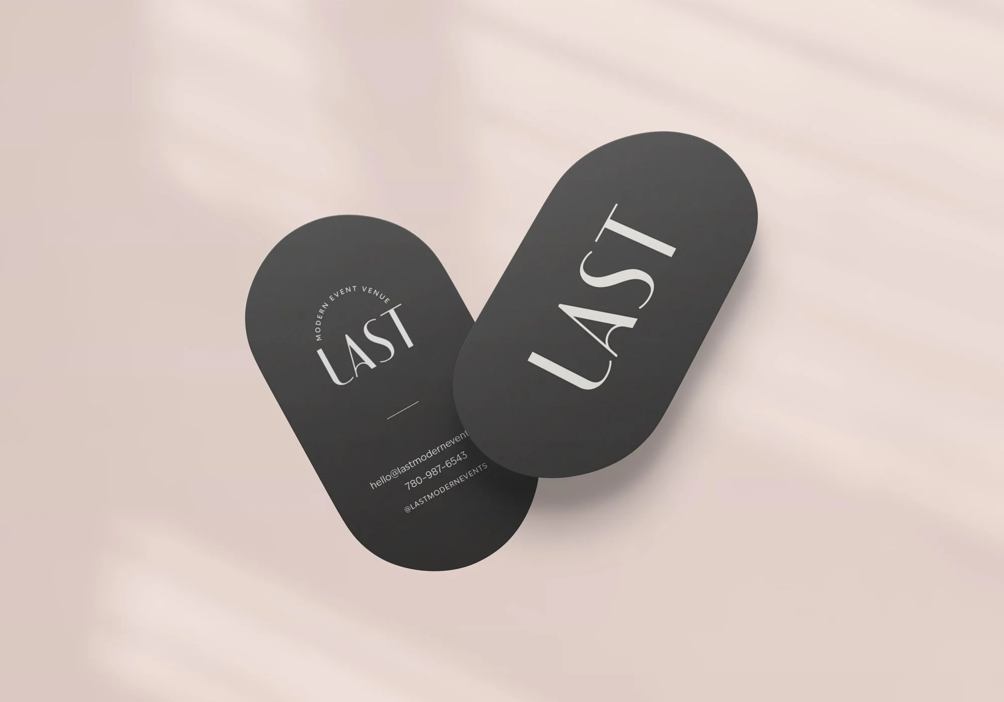
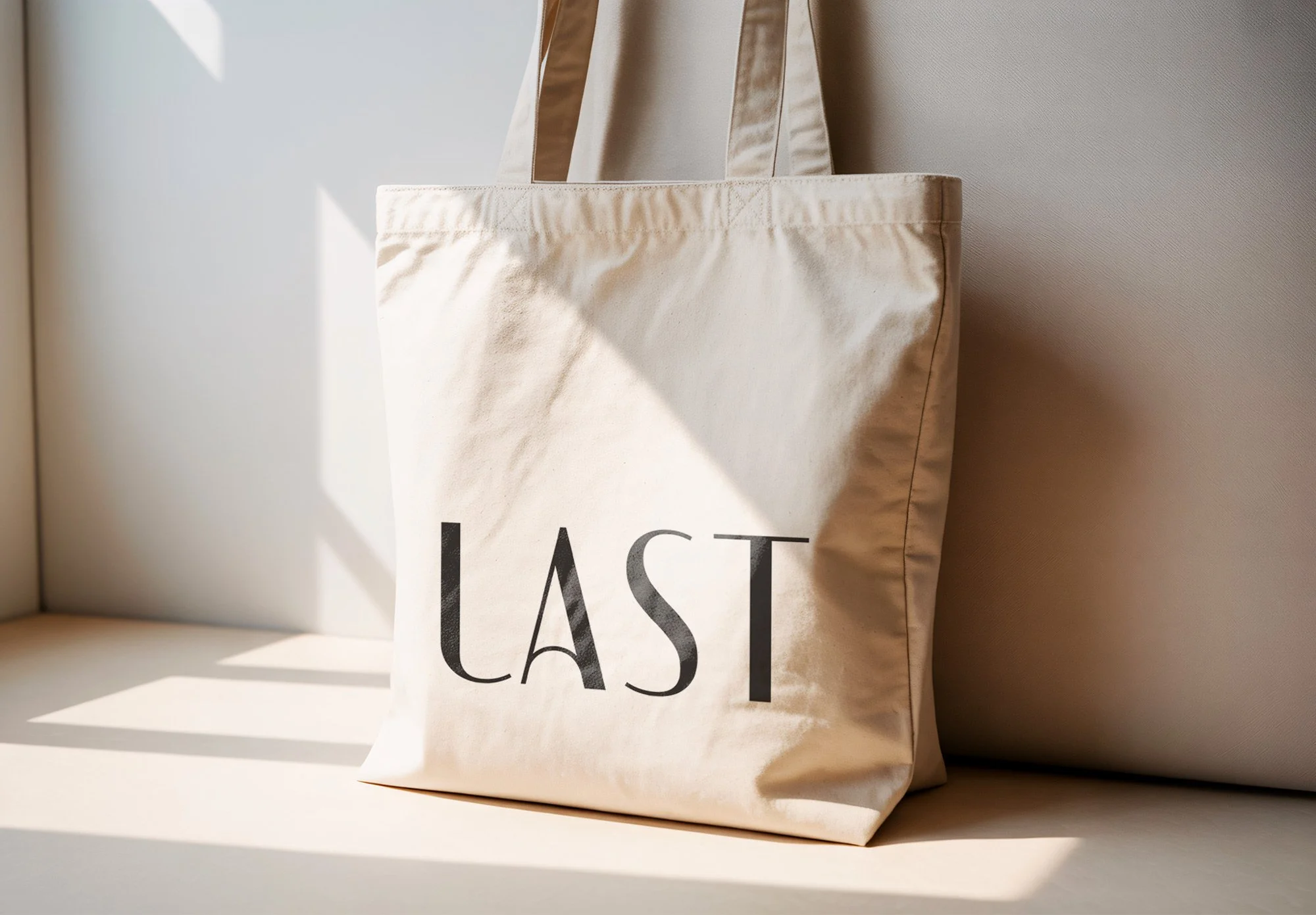
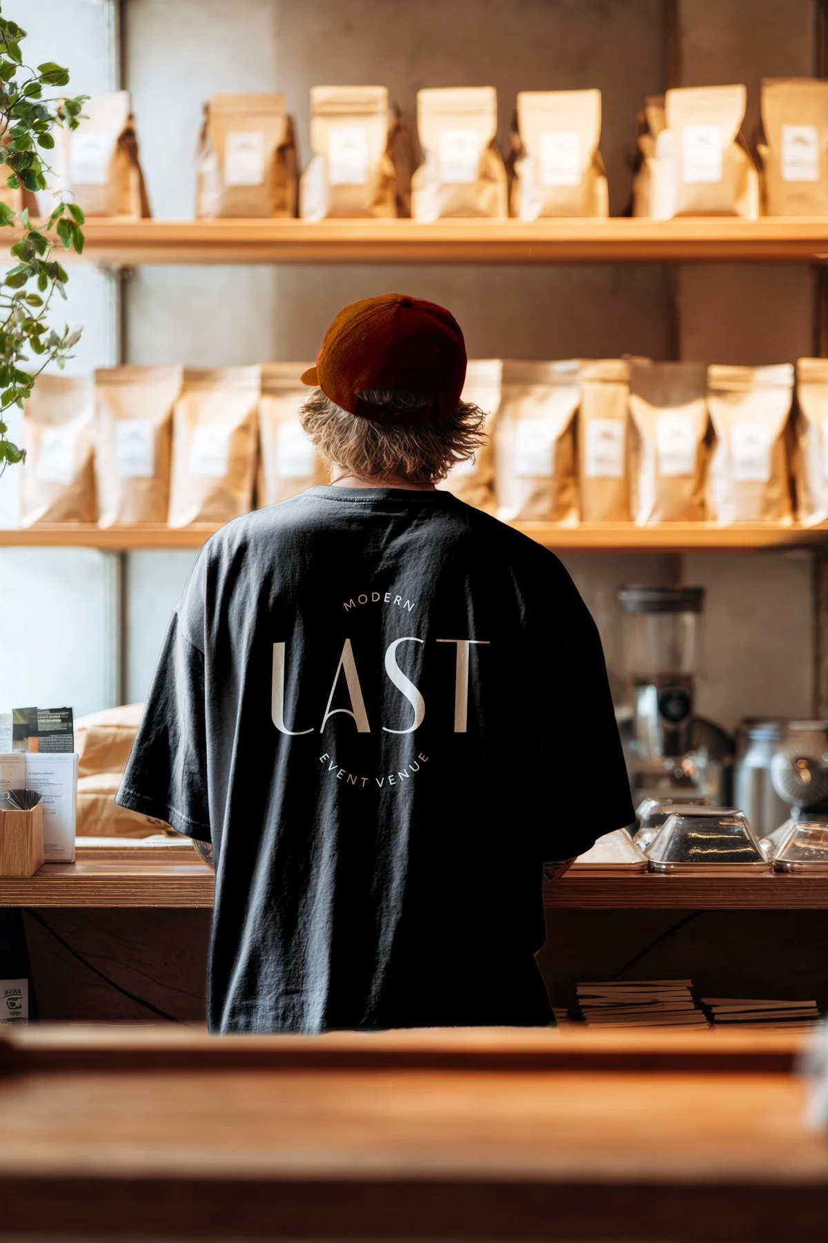
Brand Creation and Visual Identity System
Website Design (UI + UX)
Hand-off to Development
Opportunity
Designing from scratch & aligning the branding with the vision of the venue
The brand was designed from the ground up before a single wall was painted. Relying on visual references of inspiration boards and eventually construction progress as the venue began to take shape. This allowed for us to pull insipration from the finishes of the space, aligning the future in-person experience with the online presemce.
Competing venues in the city leaned into industrial and heritage aesthetics. LAST needed a visual language that felt unmistakably different. I designed the brand around the desire to feeling refined, neutral, soft, and warm.
The brand's challenge was to communicate that distinction clearly by positioning LAST as the elevated, intimate choice for couples and event planners. Every design decision had to signal quality, warmth, and the freedom for clients to make the space truly their own.
The name is the brand platform. It carries personality into the tone and laguage such as “lasting memories, lasting impressions, a slow-burn kind of love that stays.” Every design choice and client touchpoint could draw on that language.
Insights
A consistent experience leaves a positive impression
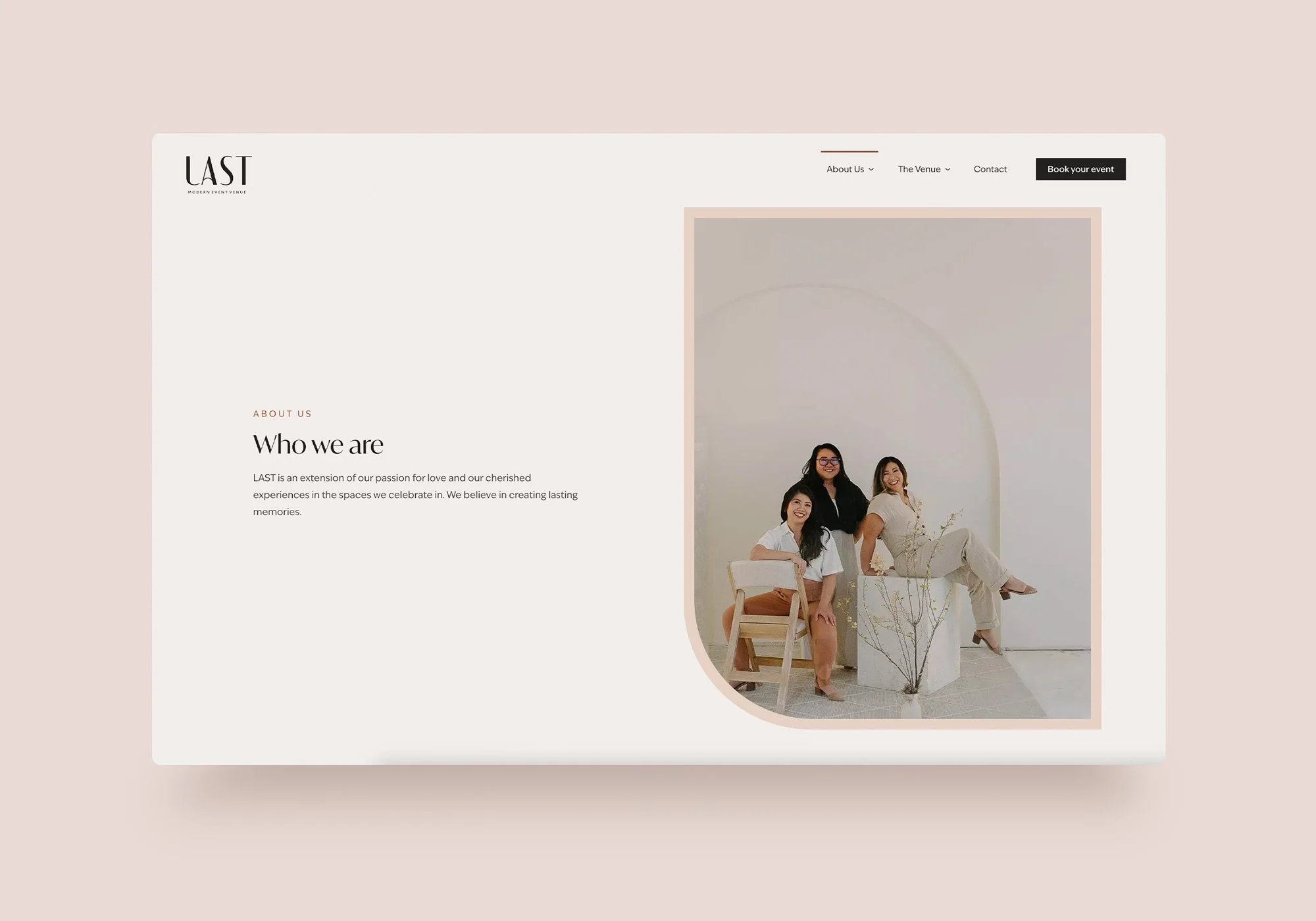
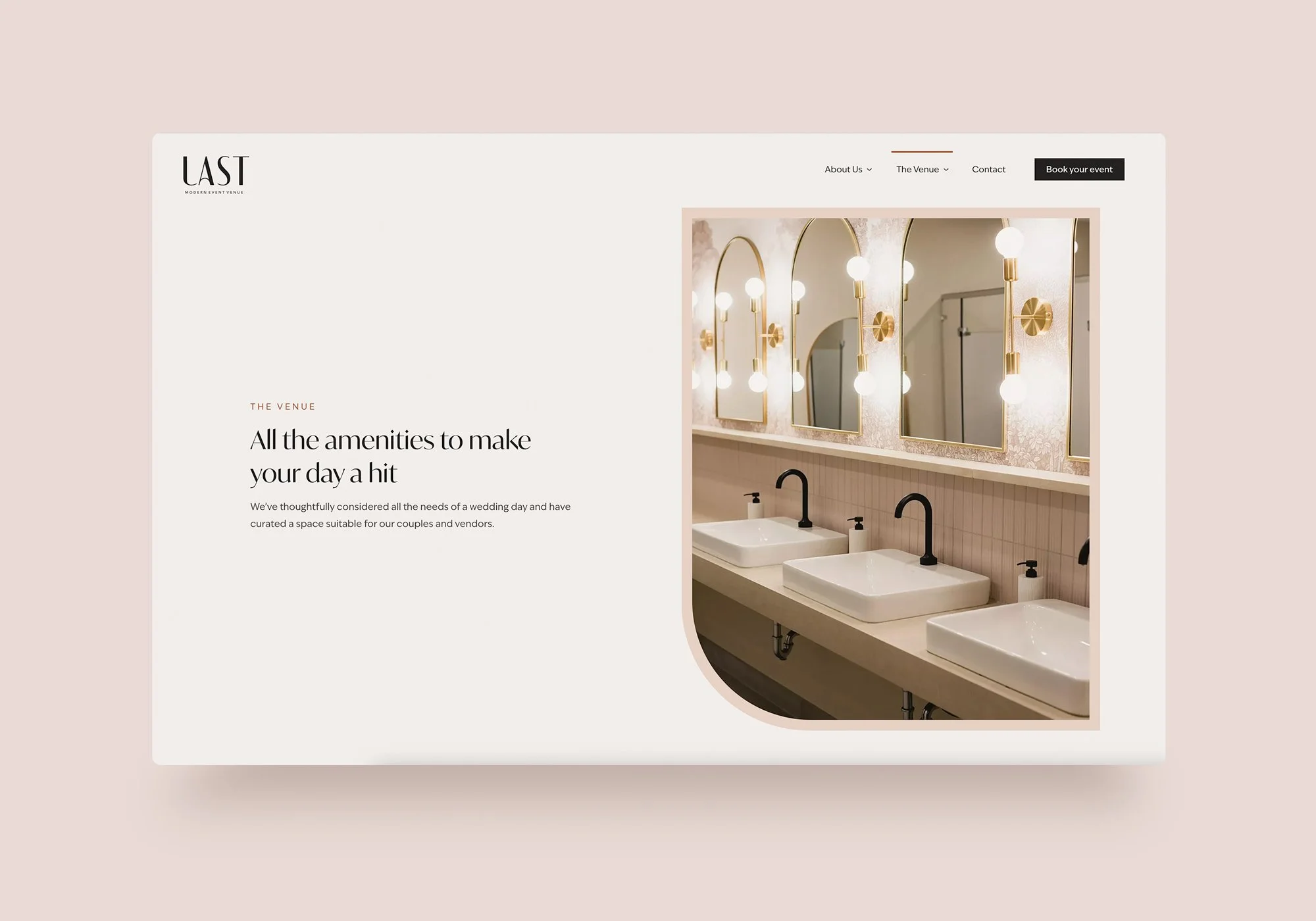
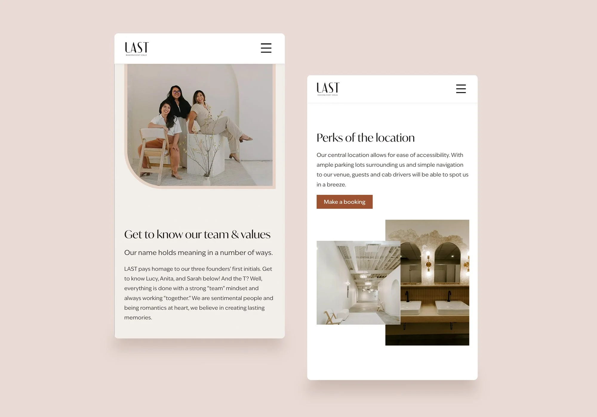
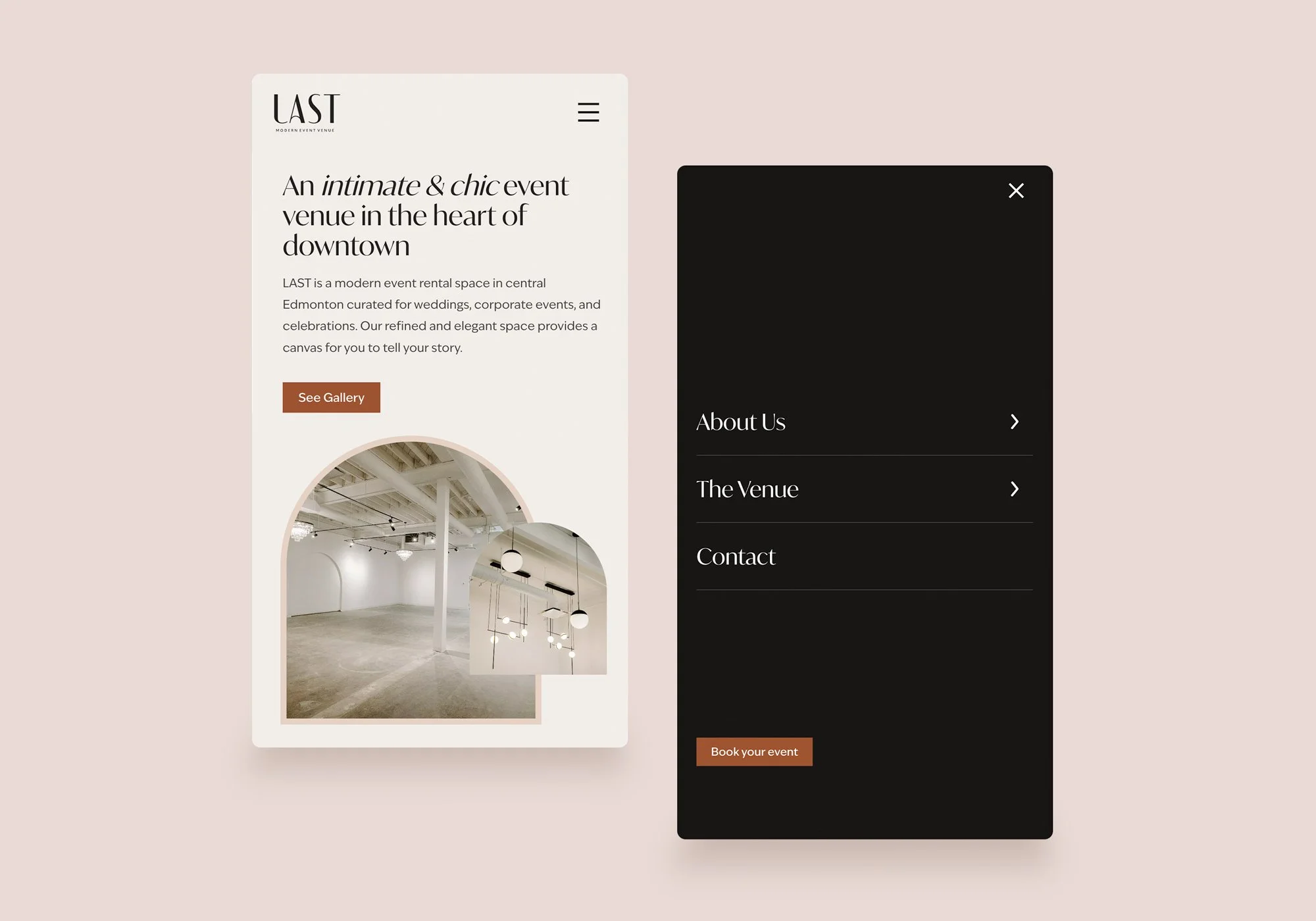
Connecting the physical space with the digital was important. The recessed arch wall in the venue was a defining physical feature. Bringing that arch shape into the brand system (ex. in the logo treatment, collateral, and graphic language) created a direct thread between the visual identity and the physical experience of the space. The website was designed to be as much of an experience as the venue. It’s an extension of the space itself. Soft photography, refined typography, and considered layout communicate the warmth and quality of the space before a visitor has ever stepped inside.
We recognized the importance of keeping the brand and client experience consistent to leave a positive impression.
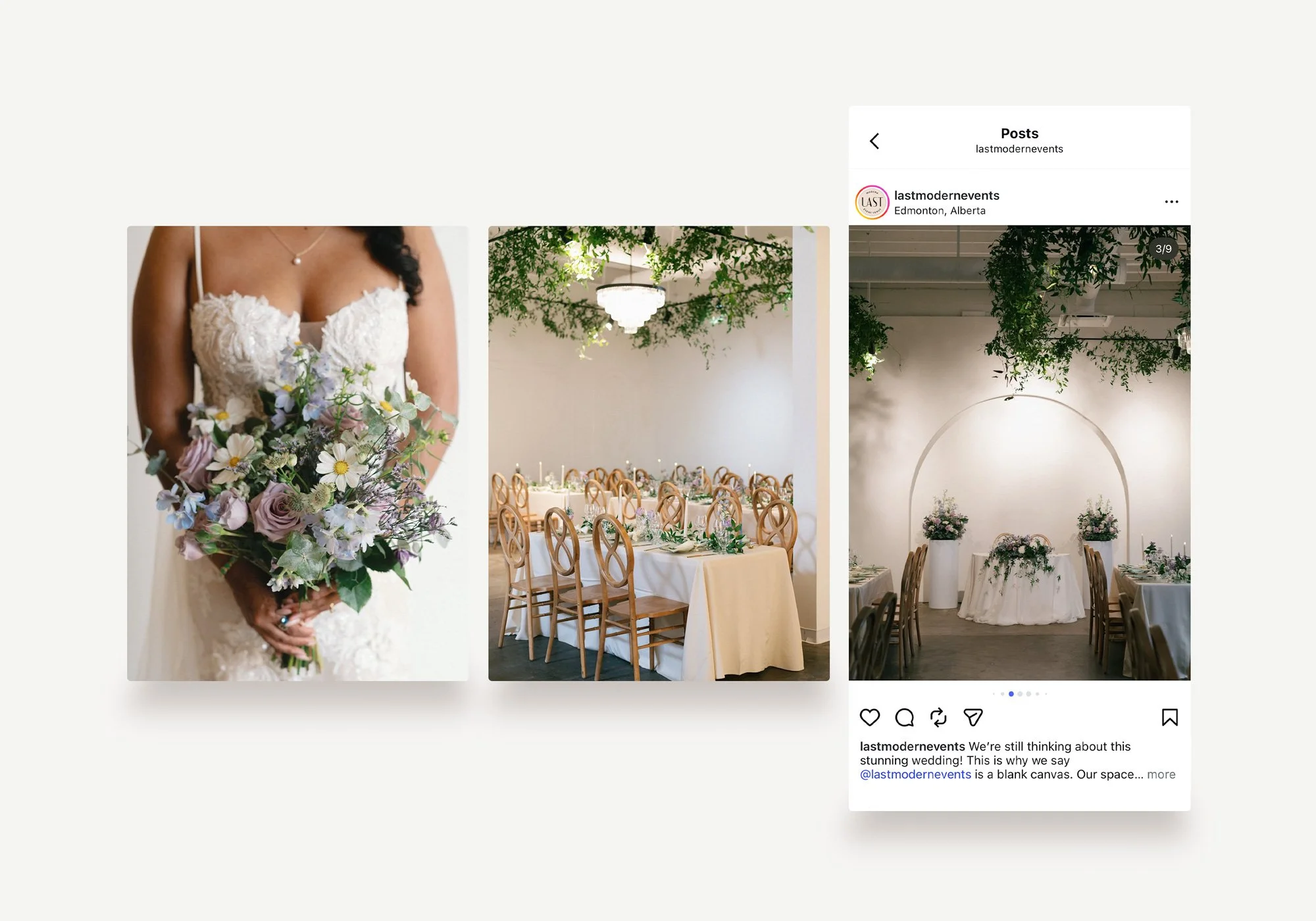
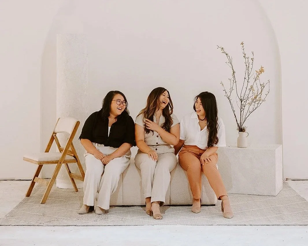
The owners brought a unique perspective as experienced wedding vendors themselves. Vendor relationships are part of the product. Unlike many venues with locked vendor lists, LAST's open approach to bringing your own choice of vendors is a genuine differentiator. This stemmed from the owner's personal experience and knowledge of the industry. The brand and communications needed to speak to vendors as much as couples, since a great vendor experience generates referrals and boosts everyone’s satisfaction. The idea and visual style of a “blank canvas” has appear to the industry as well.
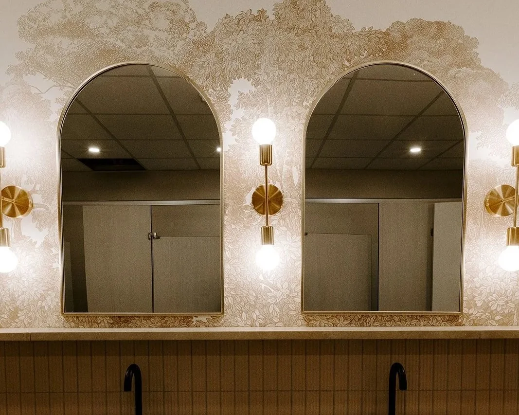
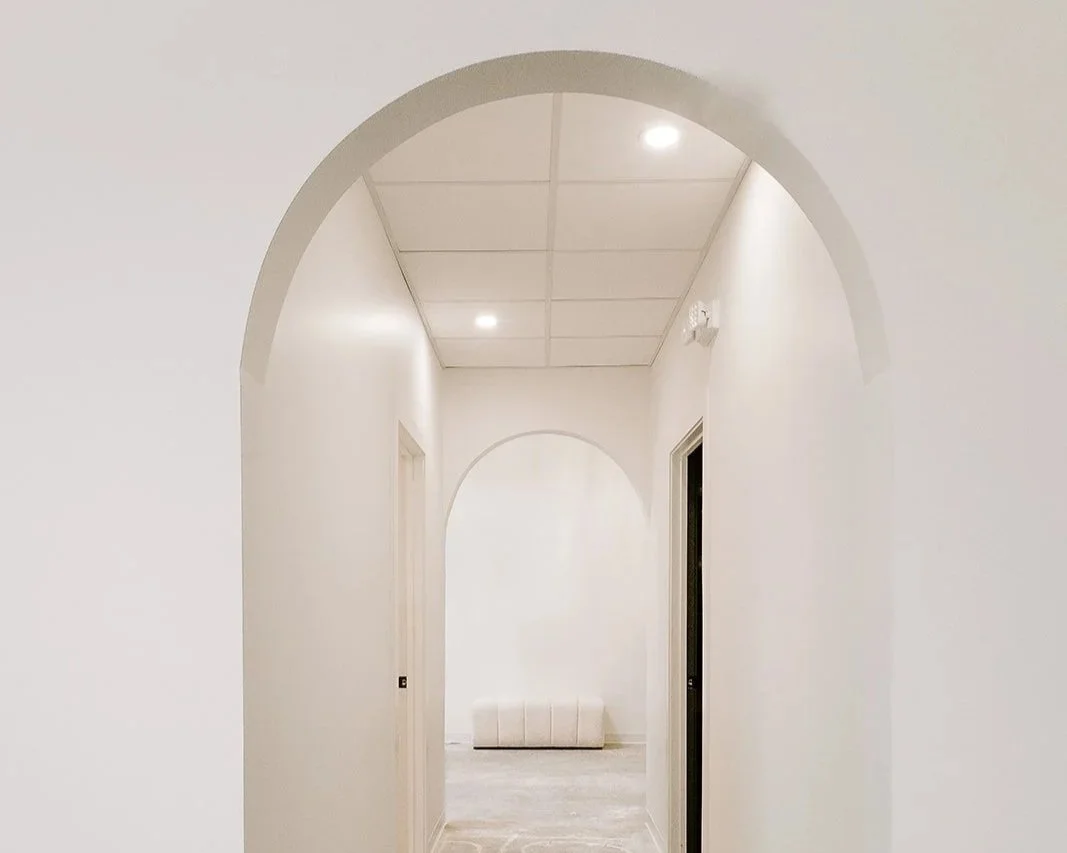
The arch in the visual identity drawn directly from the venue's signature recessed arch wall and other interior design features. It became the brand's defining shape. Used in the logo lockup, borders, website headers, and social templates, it creates an unmistakable visual link between the brand and the space it represents.
Photography credit to Dianna Mann
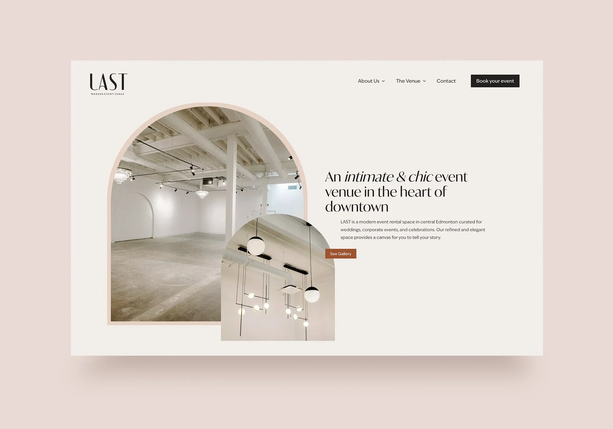
Website home page
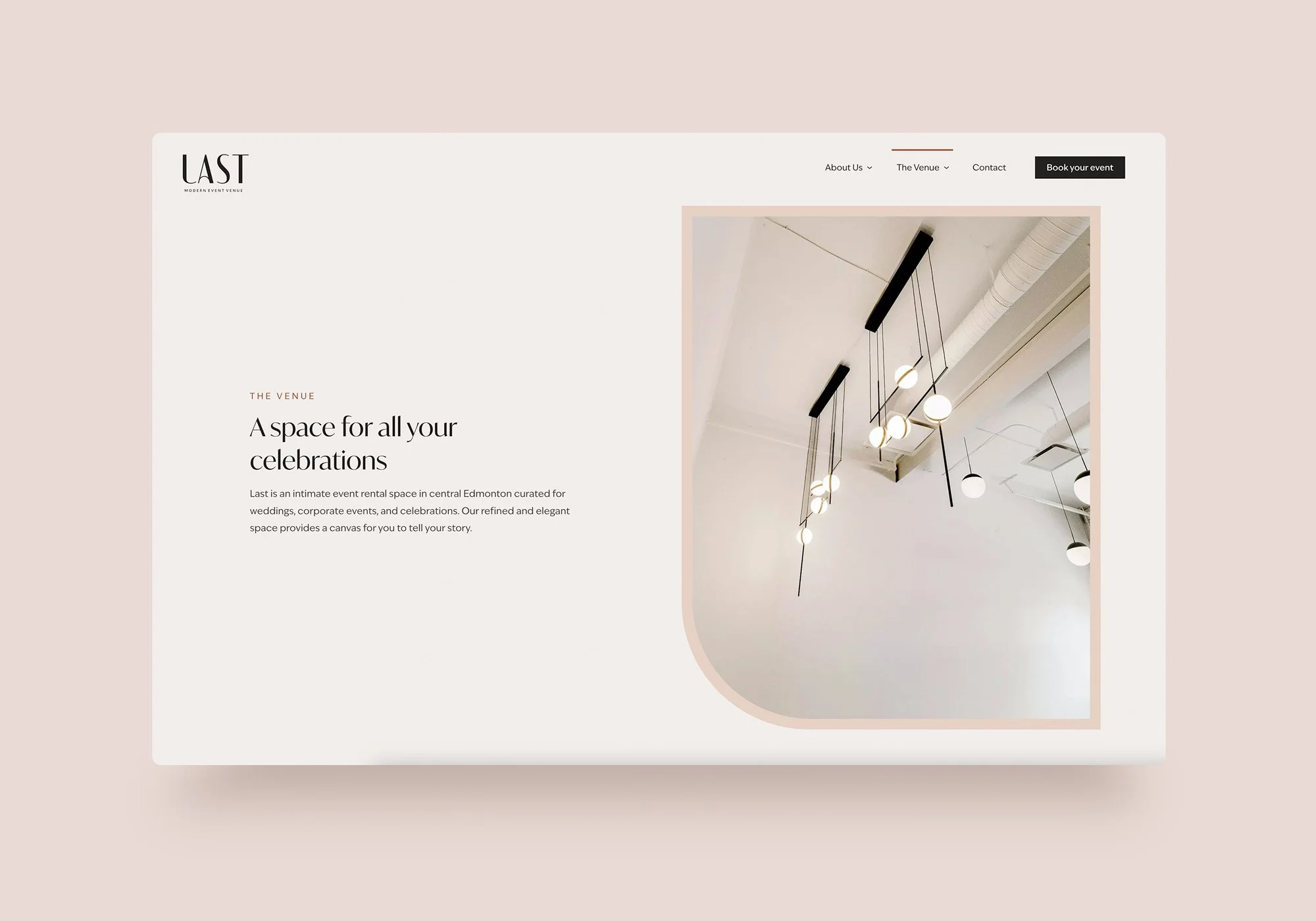
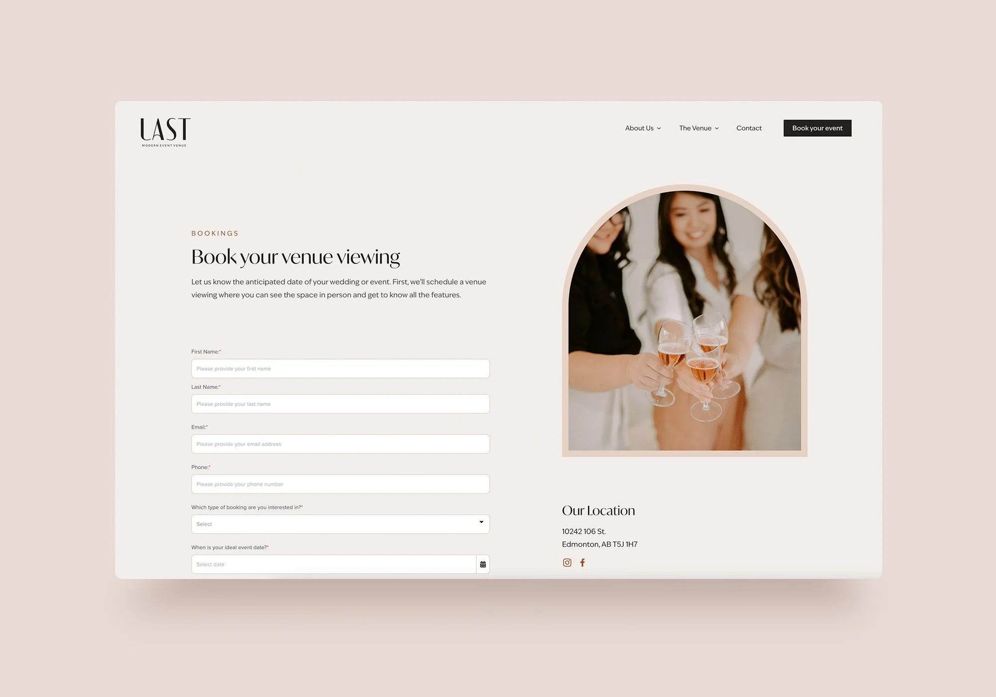
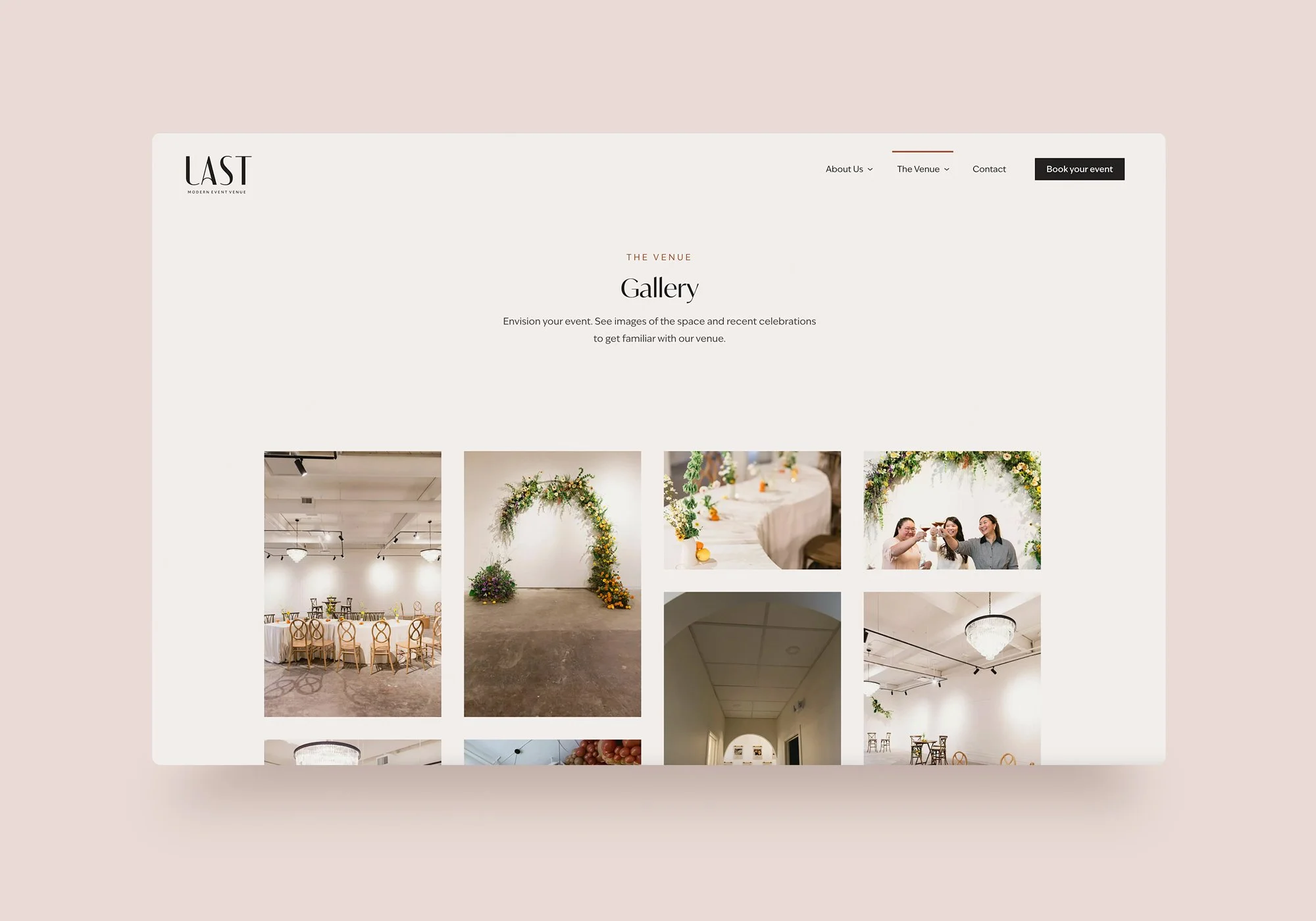
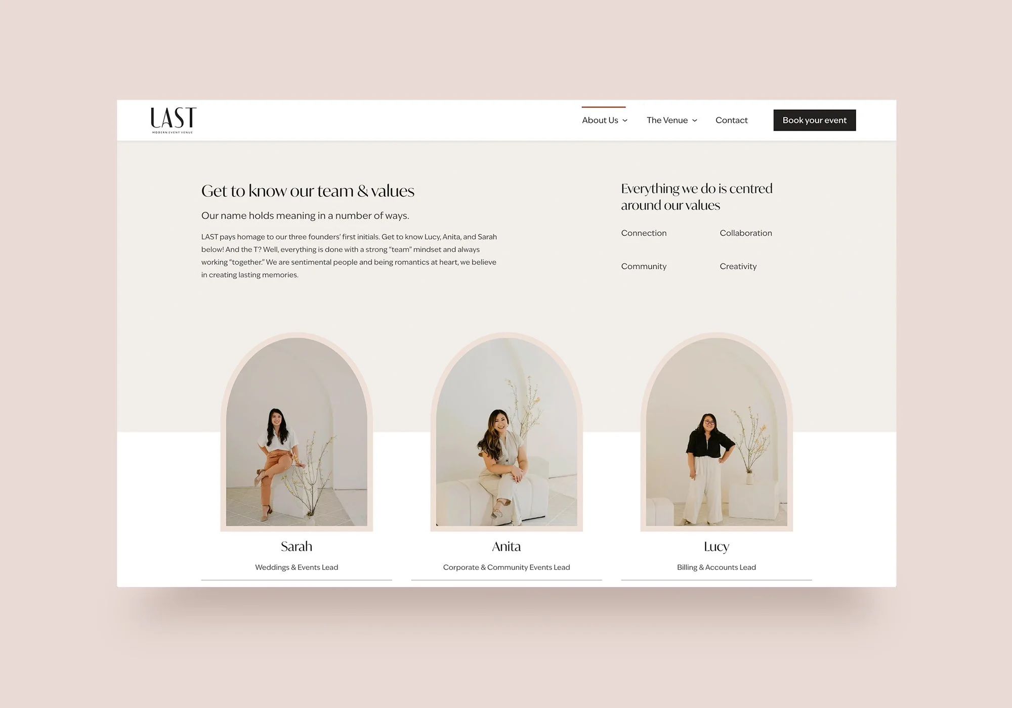
Beyond aesthetics, the site was built to convert: clear inquiry forms, a streamlined photography booking process, and dedicated pathways for weddings, corporate events, and community rentals ensure that the right audience finds the right information quickly.
Results
A refined presence that keeps filling the space celebrations and leaves a lasting impression
The project wrapped with a brand that opened doors and a digital presence that keeps filling them. The visual identity gave the founders a launch-ready professionalism and continues to highlight the unique offerings of an intimate and customizable space in the heart of downtown Edmonton. The website carries the physical experience online and prioritizes easy booking and information gathering for interested clients and vendors.
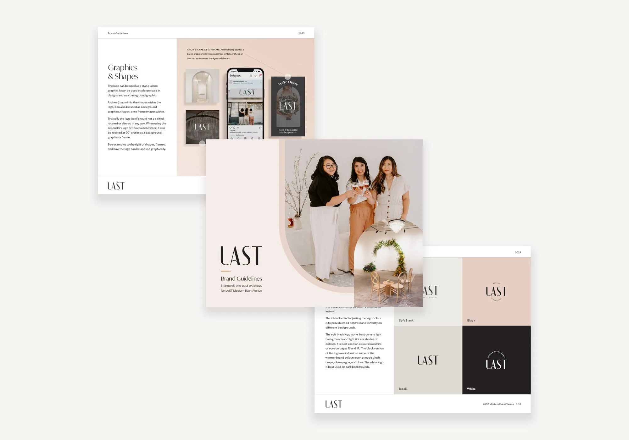
The LAST visual identity is grounded in a muted, neutral palette (warm linens, blush tones, and soft off-whites) that mirrors the physical space and gives the brand a sense of timeless elegance rather than trend-driven aesthetic.
Photography credit to Dianna Mann
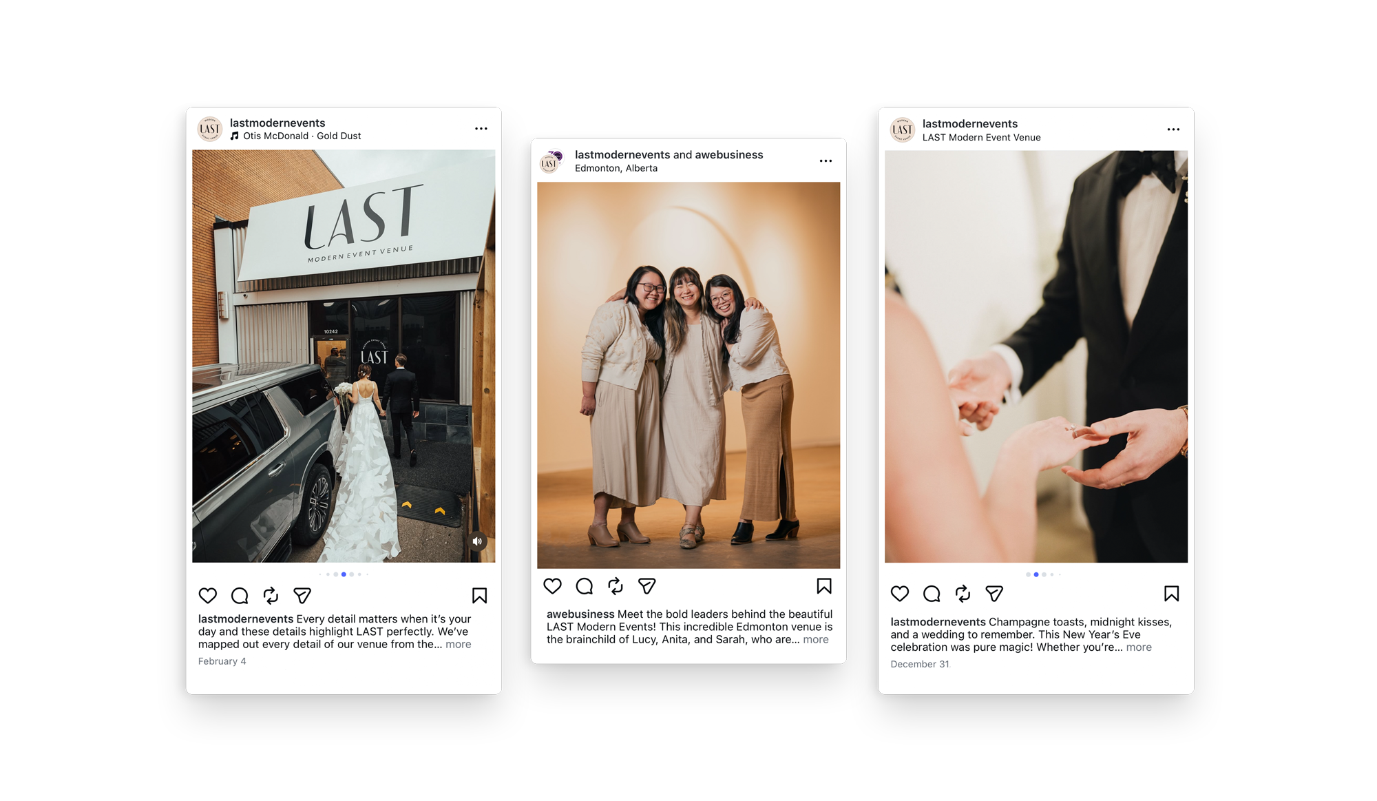
Online marketing continues to leverage the brand and build up a recognizable social presence.