Demonstrating capabilities and confidence to expand into the life sciences sector
Project Background
Applied Pharmaceutical Innovation (API) is one of Canada's largest not-for-profit life sciences commercialization organizations. They’re a hub, an innovator, and a facilitator that bridges post-secondary research and industry to bring life-saving work to the real world.
The project reflects the vibrancy of the people, research, and resources that API connects. Their brand has been flexible enough to grow and cohesive enough to hold over time. Their website was designed with the same growth and change in mind.
*This project was done at Sonder Creative.
Project Scope
Brand Creation and Visual Identity System
Website Design (UI + UX)
Wordpress Development
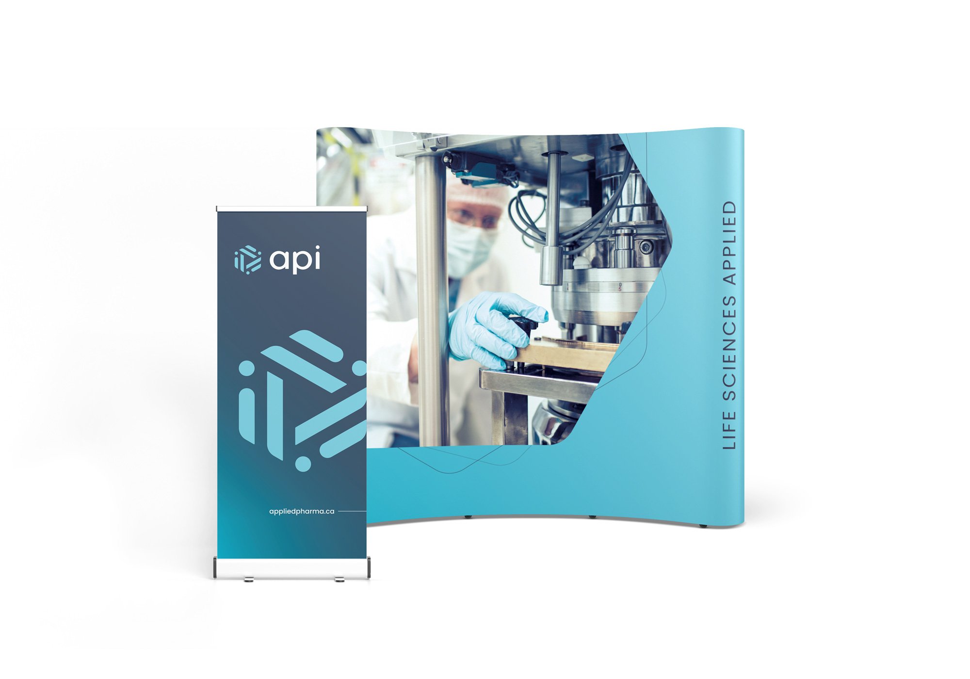
Print Design
My Contributions
Creative Direction and Lead Designer
Brand Creation and Visual Identity System
Website Design (UI + UX)
Hand-off to Development
Print Design
Opportunity
New needs have emerged as API rapidly grows in the life sciences sector
API has been evolving and defining their space in the life sciences sector. This evolution required refining the original brand (created by myself back in 2019) that has earned real recognition in the industry and maintaining recognition while expanding the visual system to reflect API's ambition and current capabilities. This challenge stretched into their online presence and website.
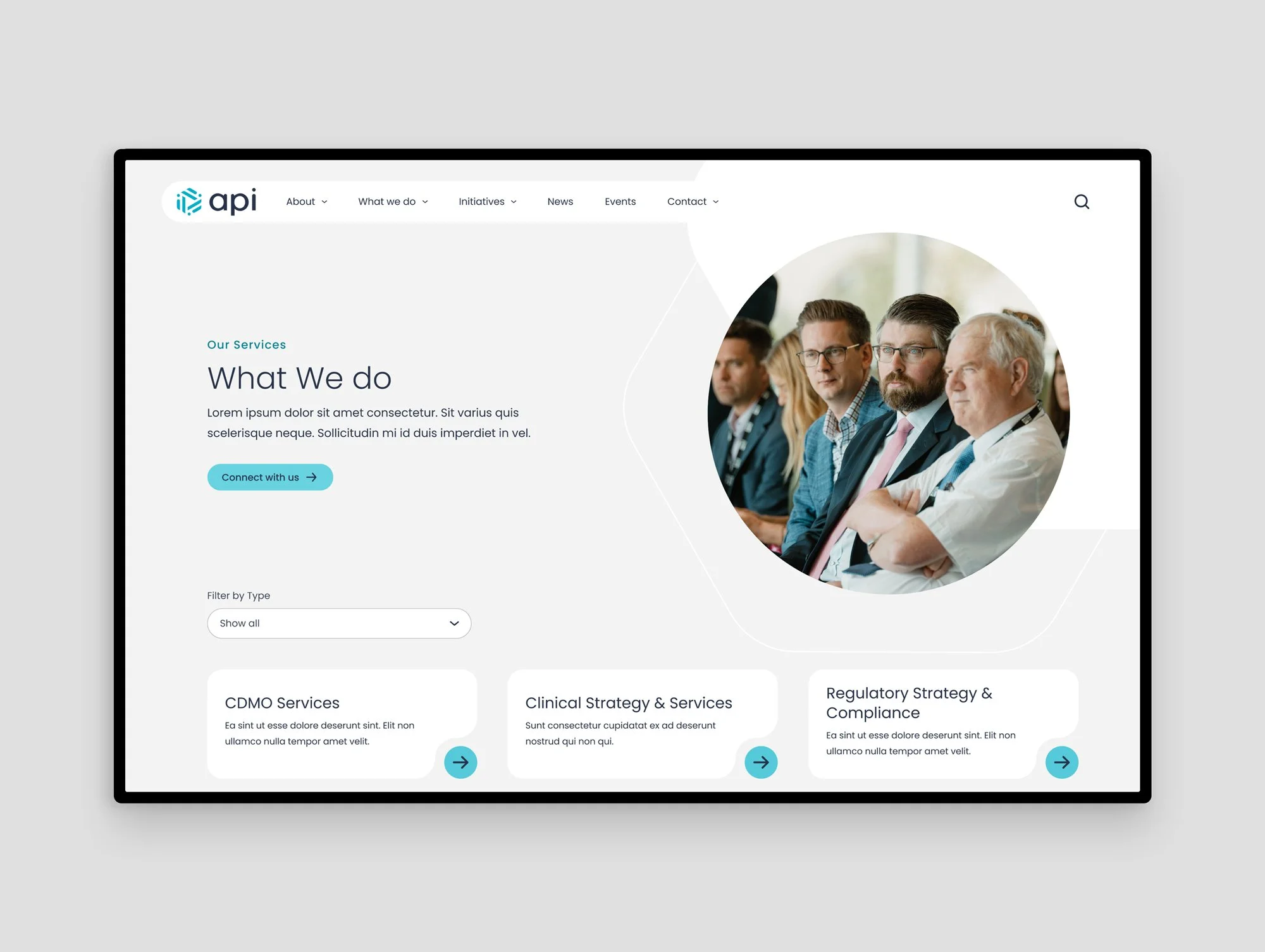
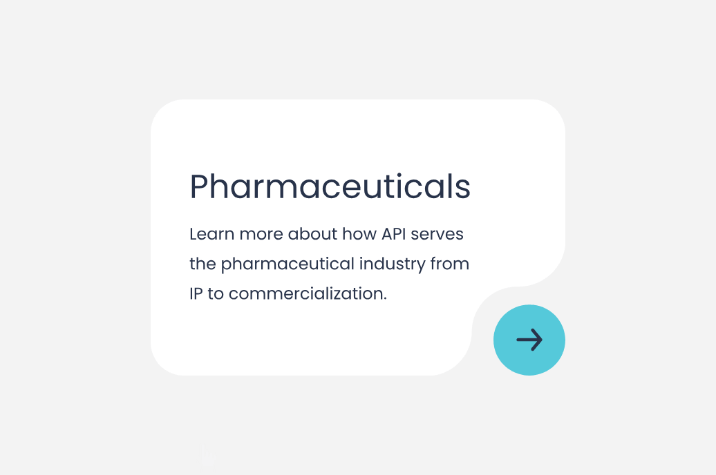
Their capabilities and offerings out-grew their former website. They needed their website to clearly communicate the complexity of the organization, showcase all their offerings, and prompt action for interested stakeholders and collaborators to reach out and connect with them. API’s audiences grew beyond pharmaceutical researchers and innovators into the life sciences sector. Both industry and academia interact with API at a variety of different stages in research, product development, and commercialisation.

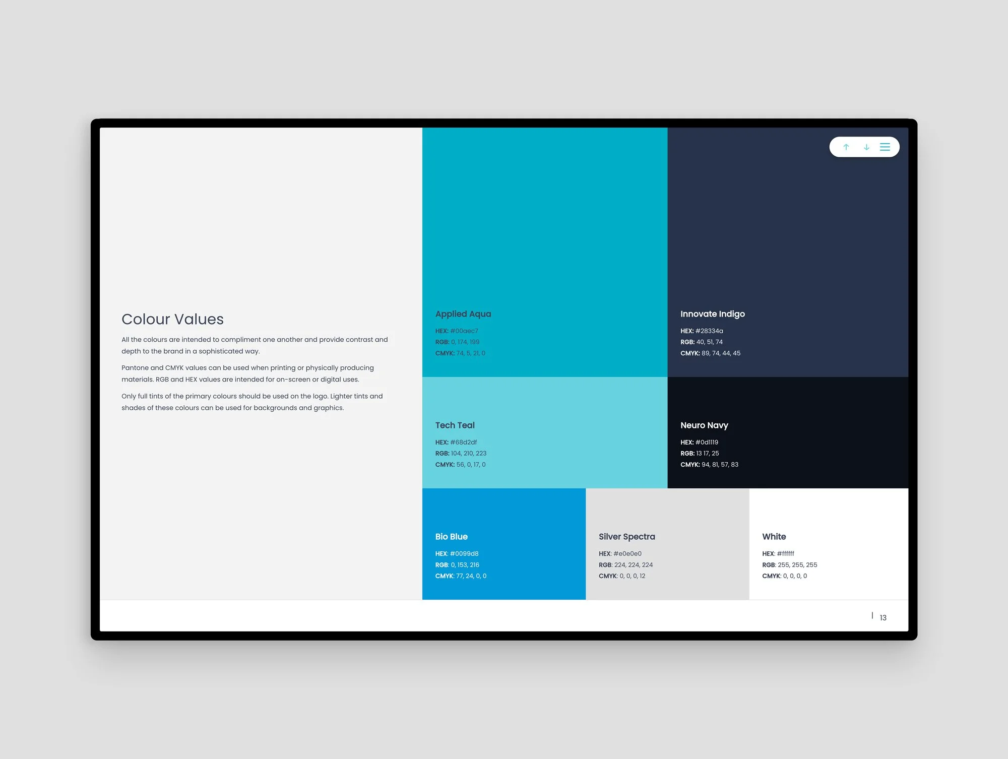
The logo and visual identity reflect concepts of core components in pharmaceuticals and chemistry. The hexagonal shapes represent the benzine ring and it’s double compounds (a key stable structure in many organic compounds). The name "API" is doing double duty: The name is both the organization's identity and a direct reference to "active pharmaceutical ingredient" which is the core component of any drug.
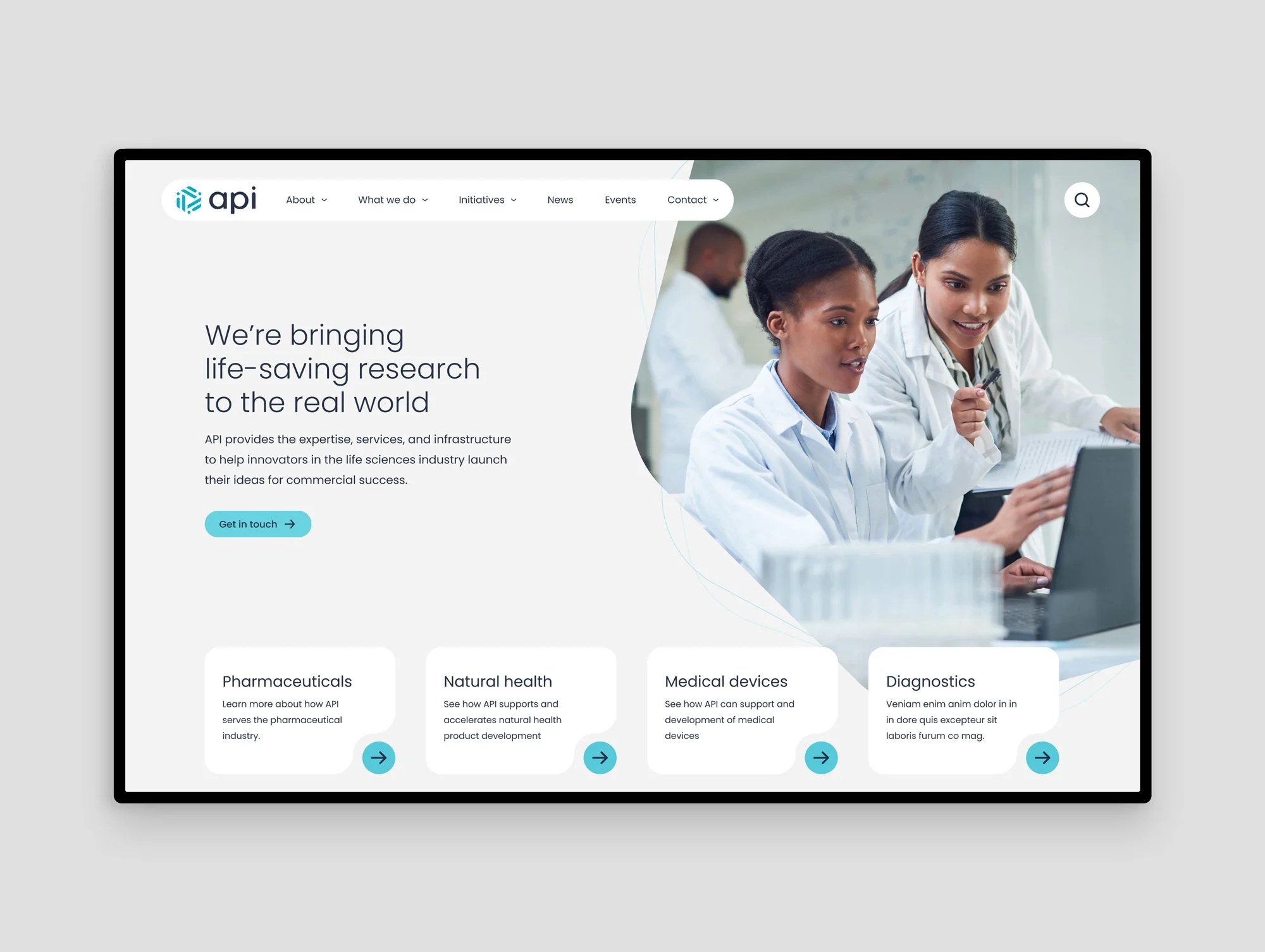
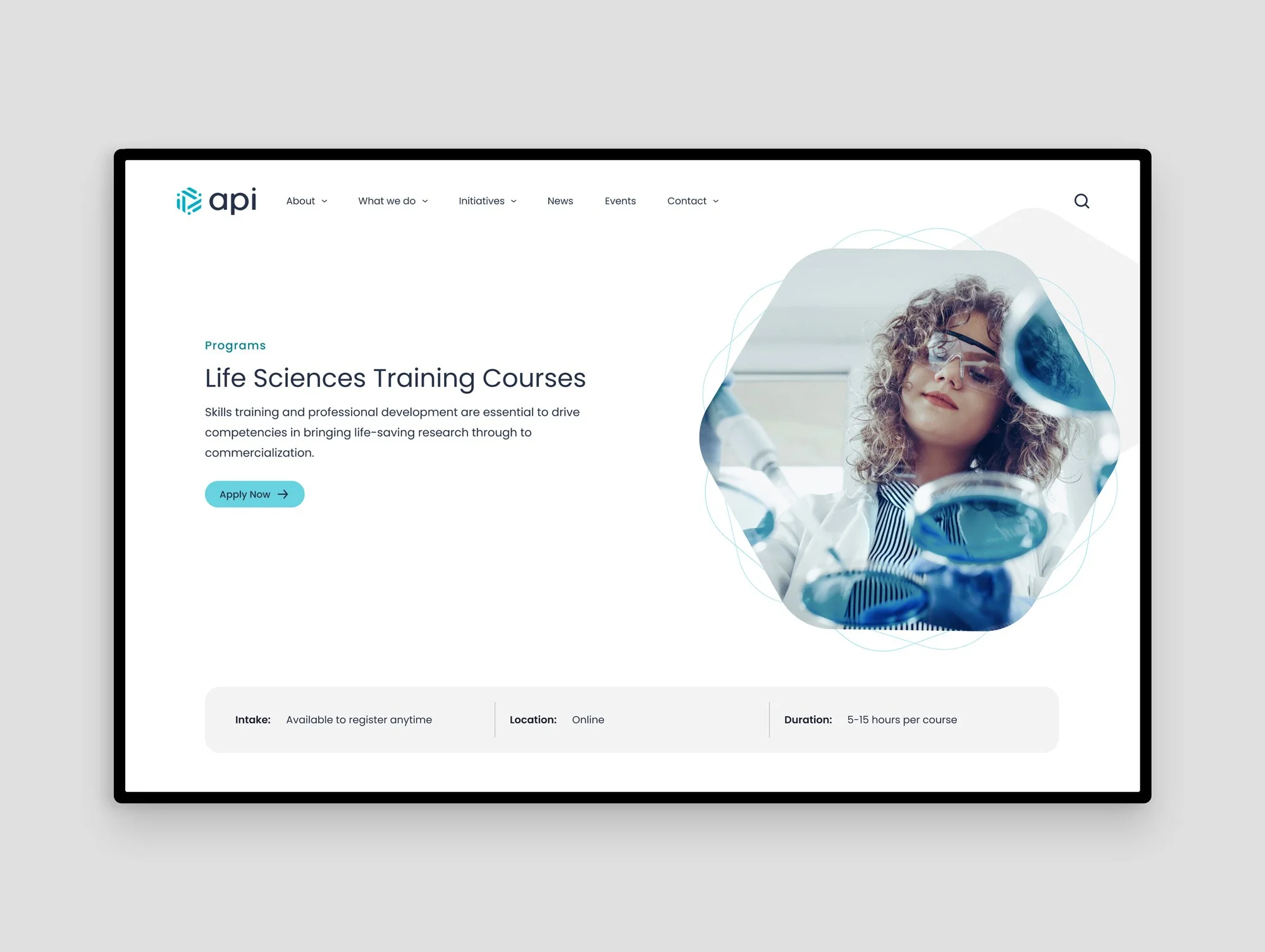
Website home page (hero section)
Insights
The website needed to show more evidence and the visual system needed to convey their forward momentum
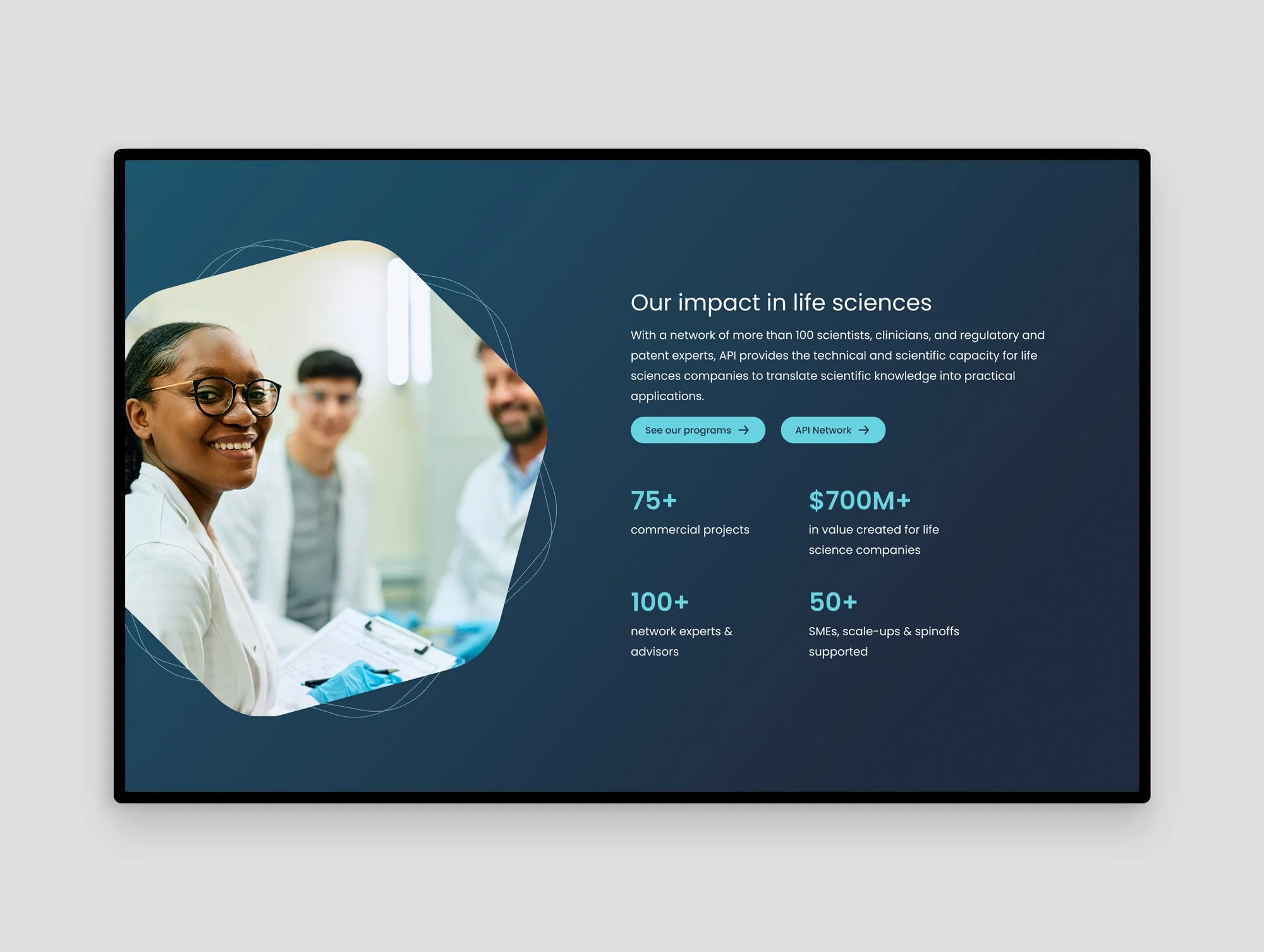
Previously used vague language about "innovation" and "expertise" doesn't move the needle or help give clarity to site visitors. We recognized the website needed to do more than claim their successes. API's audiences respond to evidence: facilities, outcomes, partnerships, and track records to offer a way of showing (not just telling) what they’re currently working on, have accomplished, and their thought leadership in the sector.
API's ambition and track record required a bolder visual approach compared to many conservative companies in the sector. The design demonstrates innovation and energy, while still showcasing professional capability. Visual boldness, including the introduction of more saturated colours and use of unique shapes to do so. Geometric shapes are drawn from molecular and chemical visual references, staying true to how the brand began and initially gained recognition. While the addition of subtle animations, movement, and technical feeling line-work convey their forward momentum and dynamism and expertise.
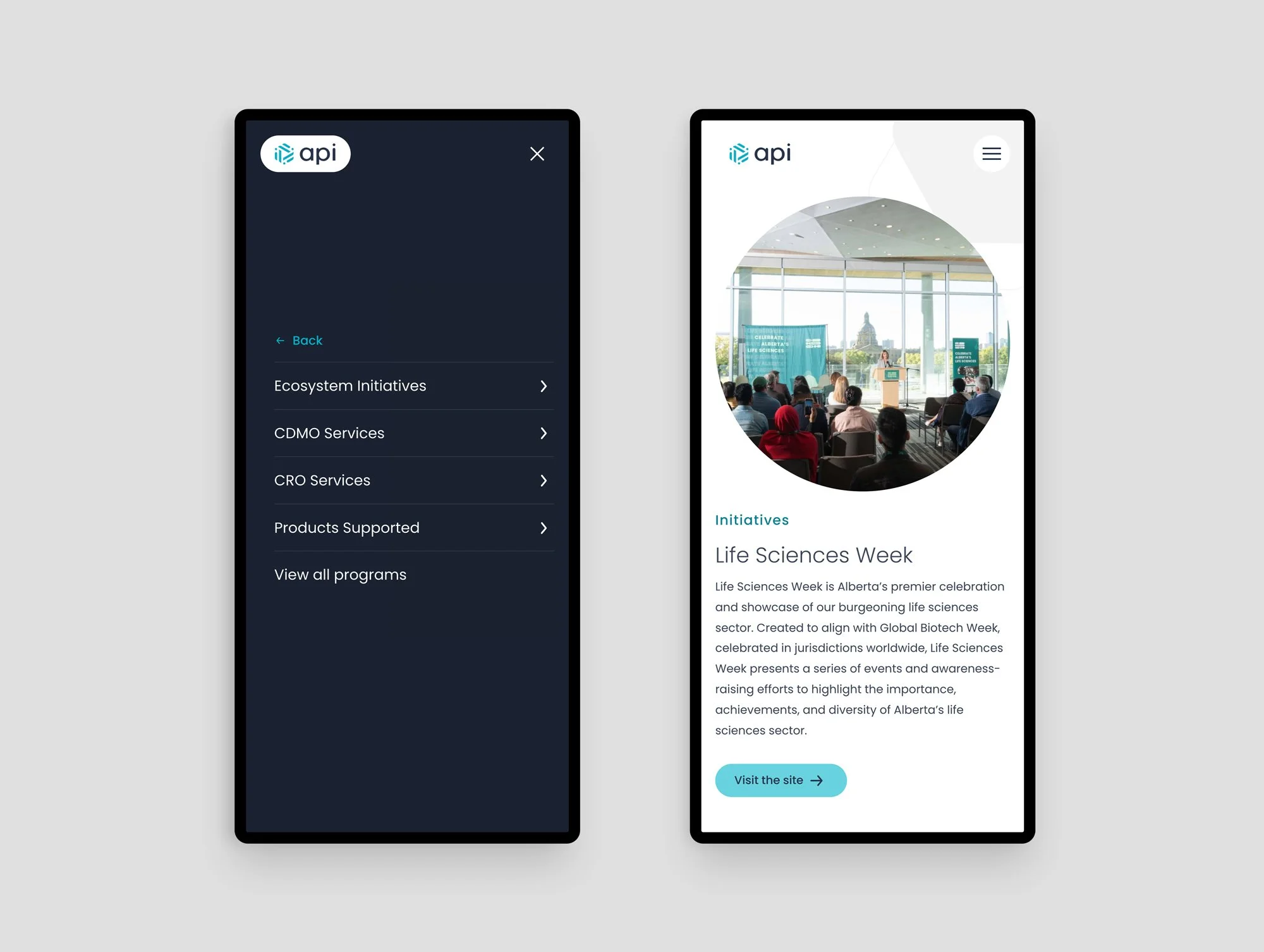
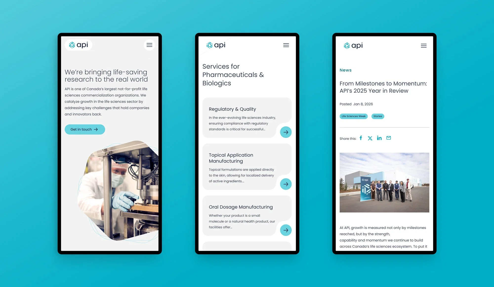
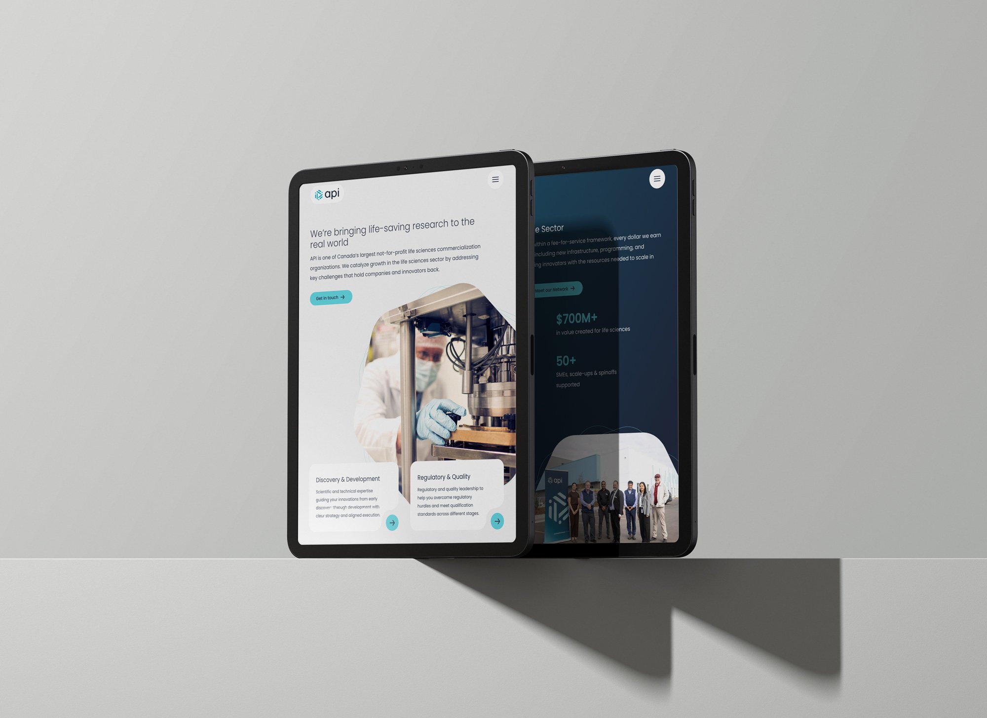
Website (mobile view) home page, services page, and news post
UI interactions that feel on-brand with growth and rotation movements.
Subtle animations of hexagonal shapes rotating around images adds to the feeling of momentum and progress on the website.
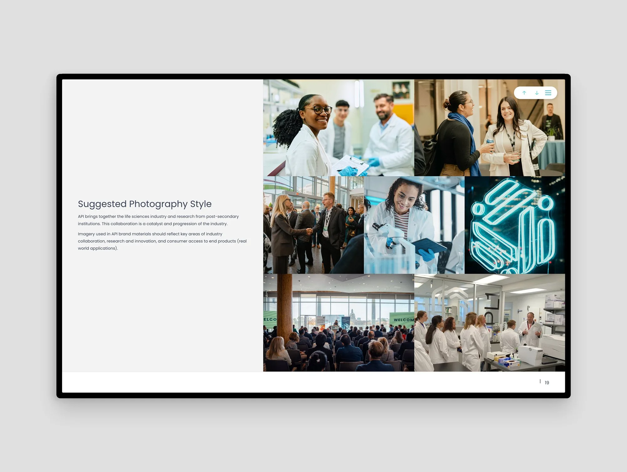
Neon sign of the logo in the API headquarters showcasing “vibrancy” in their physical space.
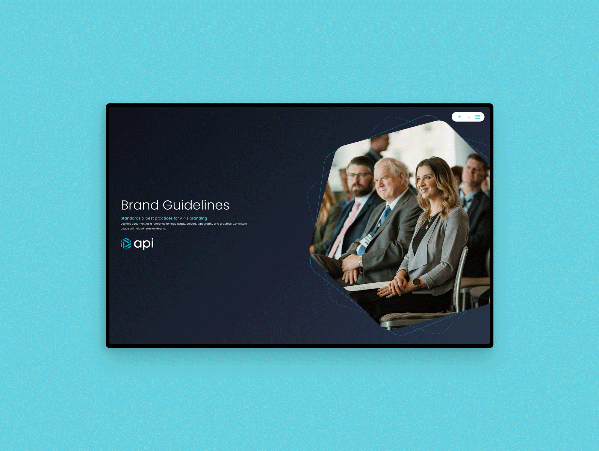
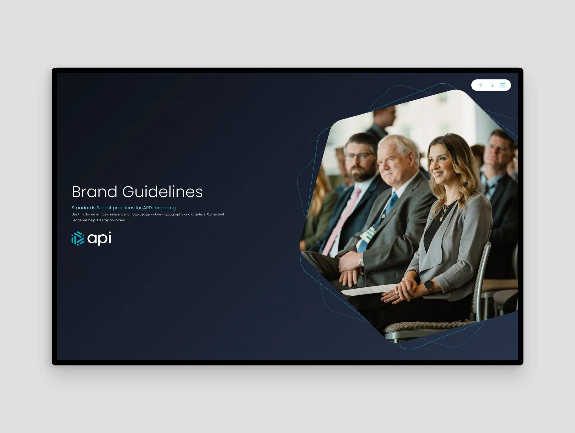
Digital brand guidelines (built into the website) for organization-wide consistency and easy access for API’s marketing team.
Results
Championing a brand and digital experience that suits their work, growth, and leading capabilities.
The result is a brand that feels established and confident, but unmistakably modern. Their website and digital experience reflects their offerings and communicates their story. The redesigned site organizes API's full scope of services, facilities, and initiatives in a way that's navigable for any audience — from first-time visitors to long-term partners. Animated elements on the website give API a dynamic, living quality that matches the energy of the organization.
It’s intended to grow with them as services and offerings evolve. The site is managed by their team so they can rapidly add services, create posts and share news as they host events. make industry break-throughs, and evolve their team.