
Levelling up the digital experience for a growing design studio
Project Background
Sonder Creative is a growing web and branding studio. Heavily focused on digital experiences for a broad range of clients from corporate, medical, and biotech, to small local businesses such as wedding venues, consultants, and shops – their scope posed a challenge to communicate their value within all these potential industries. The challenge became keeping up with their own communications and properly articulating growing service offerings, when the team is busy lifting up their clients’ work.
Project Scope
Business Planning and Strategy
Brand and Visual Identity System
Website Design (UI + UX)
Wordpress Development
My Contributions
Creative Direction and Lead Designer
Brand Strategy + Design
Website Design (UI + UX)
Hand-off to Development
Copywriting and Positioning
Opportunity
Attracting new scopes of work, while still maintaining the familiar and personable tone-of-voice.
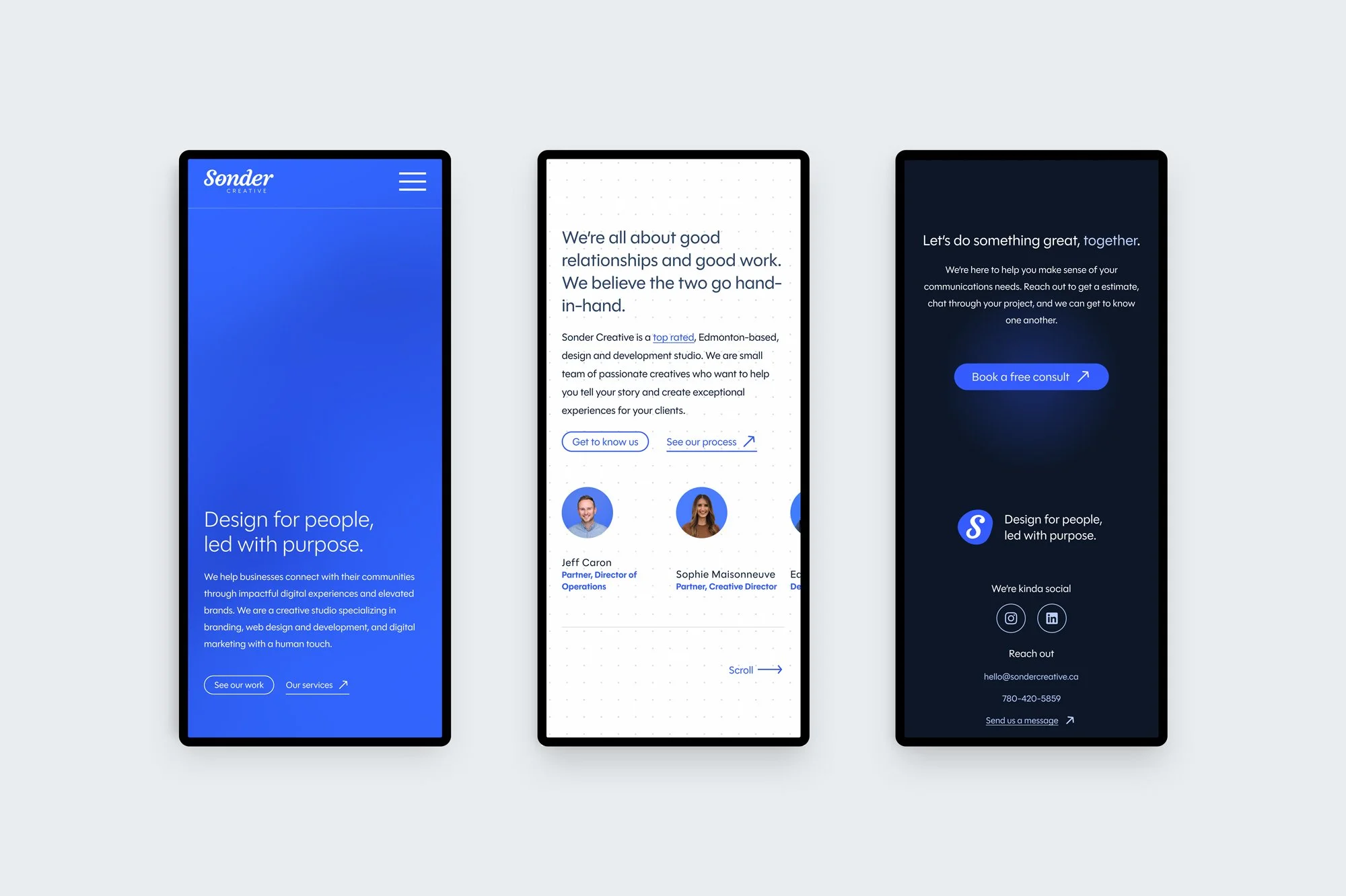
Connecting and building relationships is at the core of Sonder. Being heavily referrals-based, it was important to maintain some familiarity in the studio’s website refresh. It was identified that the tone-of-voice resonated with current and past clients, making them feel supported, understood, and part of the team. However, service offerings and portfolio work easily became outdated as the studio grew. Existing and new clients became unaware of expanded service offerings because they weren’t communicated anywhere. The opportunity was obvious to better articulate “what we do” in a systematic approach – making it easier as growth and expansion keep happening.
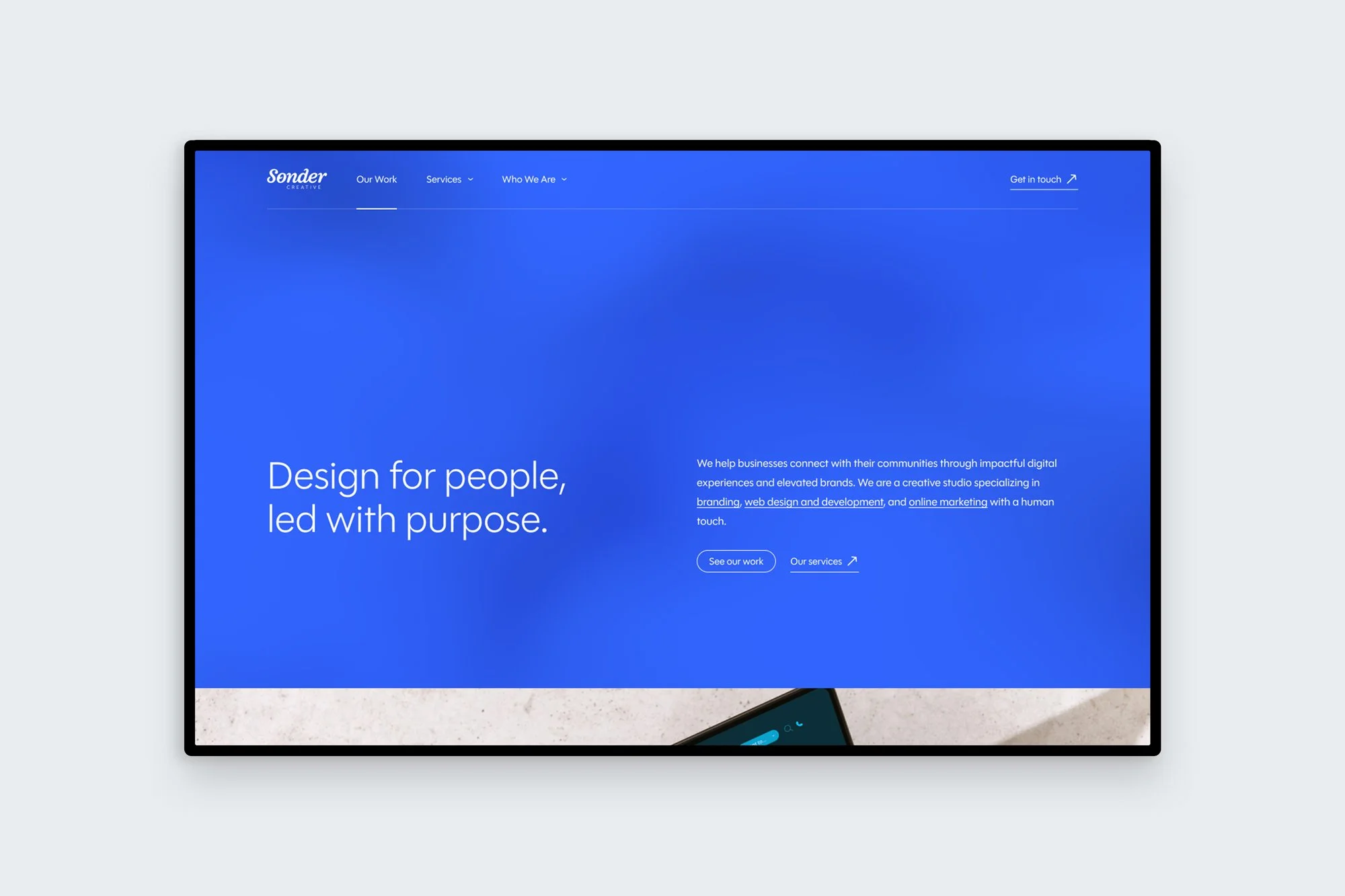
Home page: Clear call-to-actions (CTAs) are present from the moment someone lands on the homepage. This is coupled with a fluid gradient background that adds ambient texture, but doesn’t detract from the immediate main messages. The brand leads with a confident and minimalist aesthetic that still feels highly branded, but let's the portfolio work below the fold shine. The main focus of the site is communicating the benefits or outcomes to potential clients.
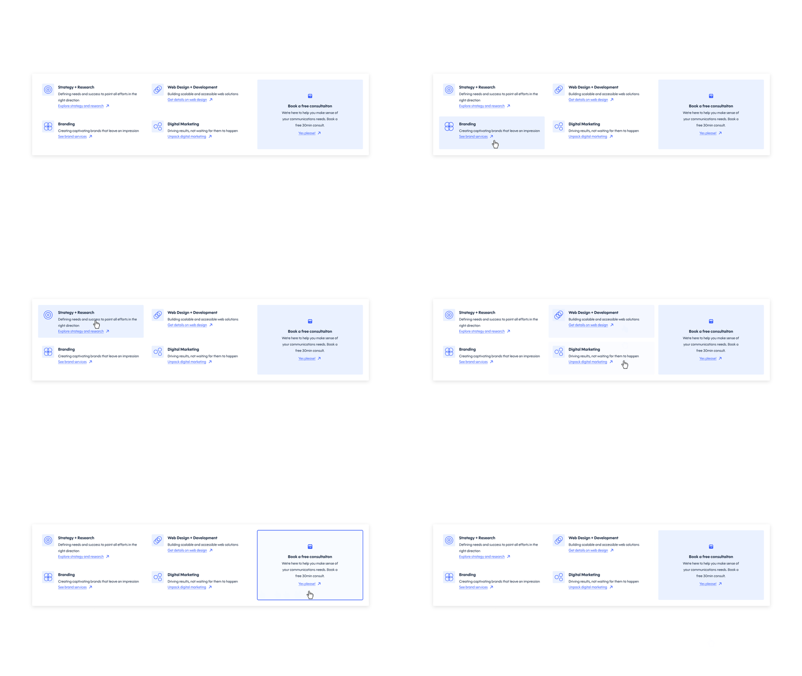
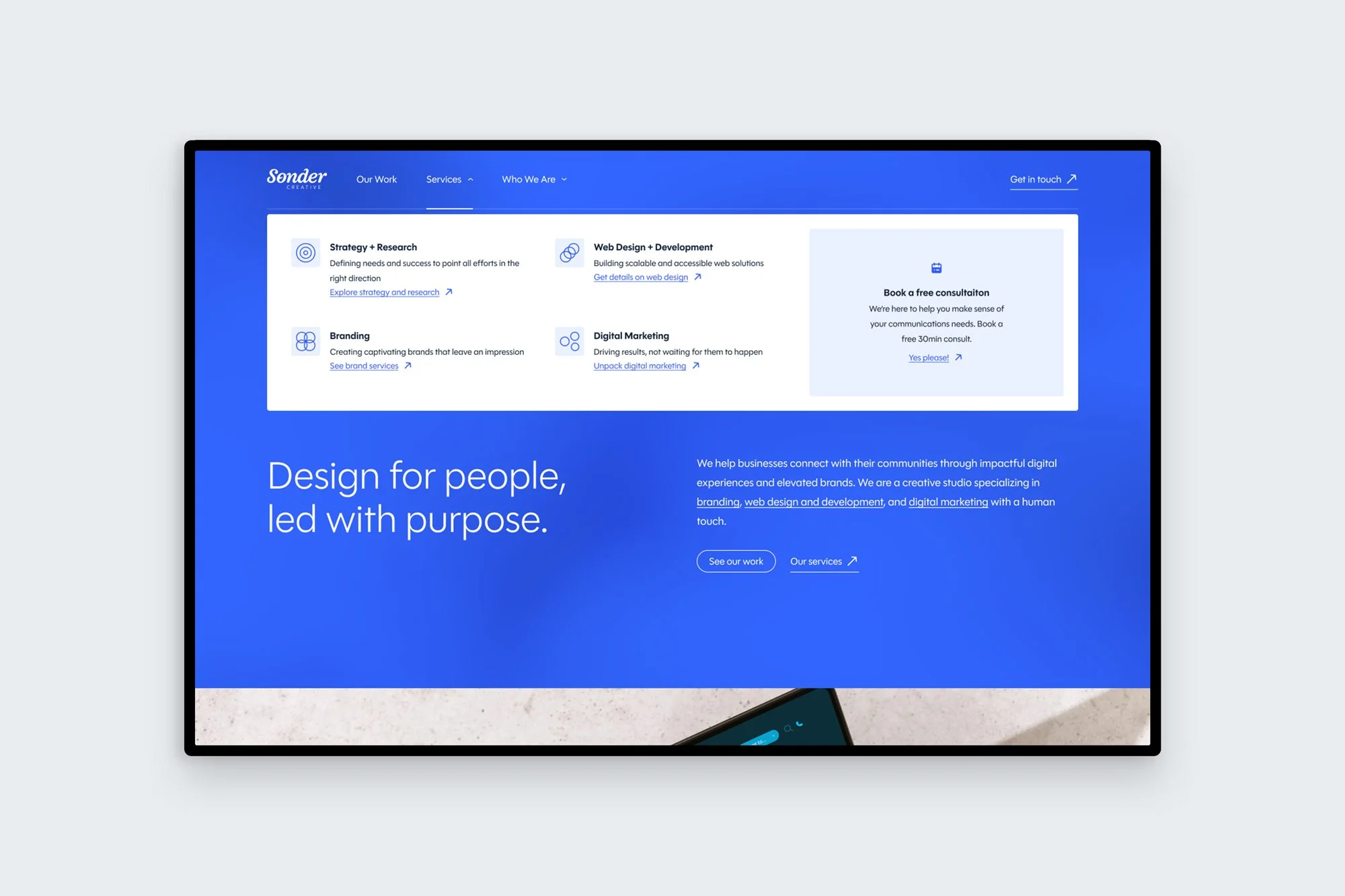
Services navigation: Visual, yet simple and straightforward navigation guides site visitors directly to core services pages and offerings. A consistent CTA is present across the site, including within the services menu to continuously prompt a consultation and get in front of potential new clients.
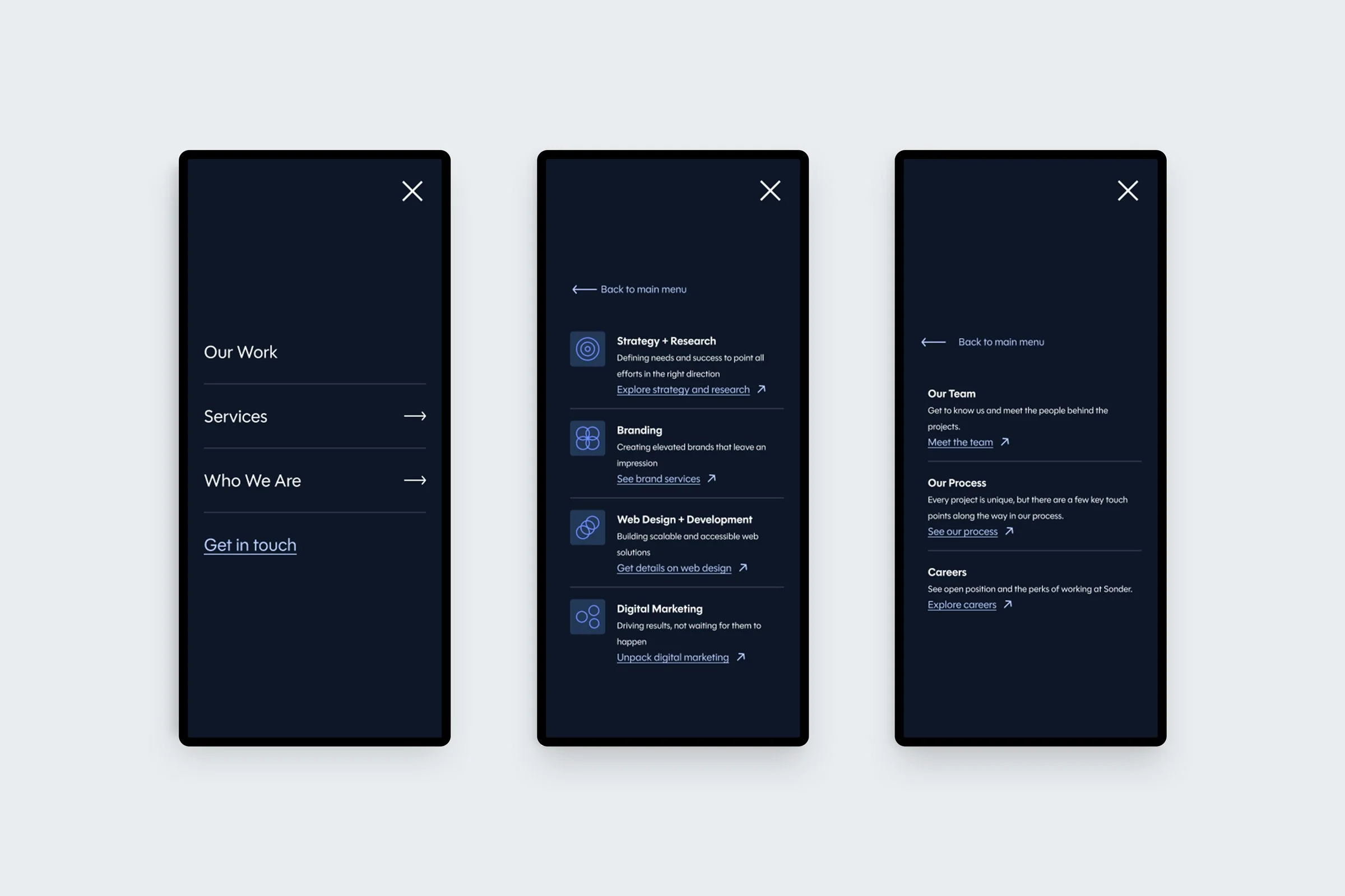
Navigation is designed in both light and dark modes and is well-considered for translating to mobile experiences.
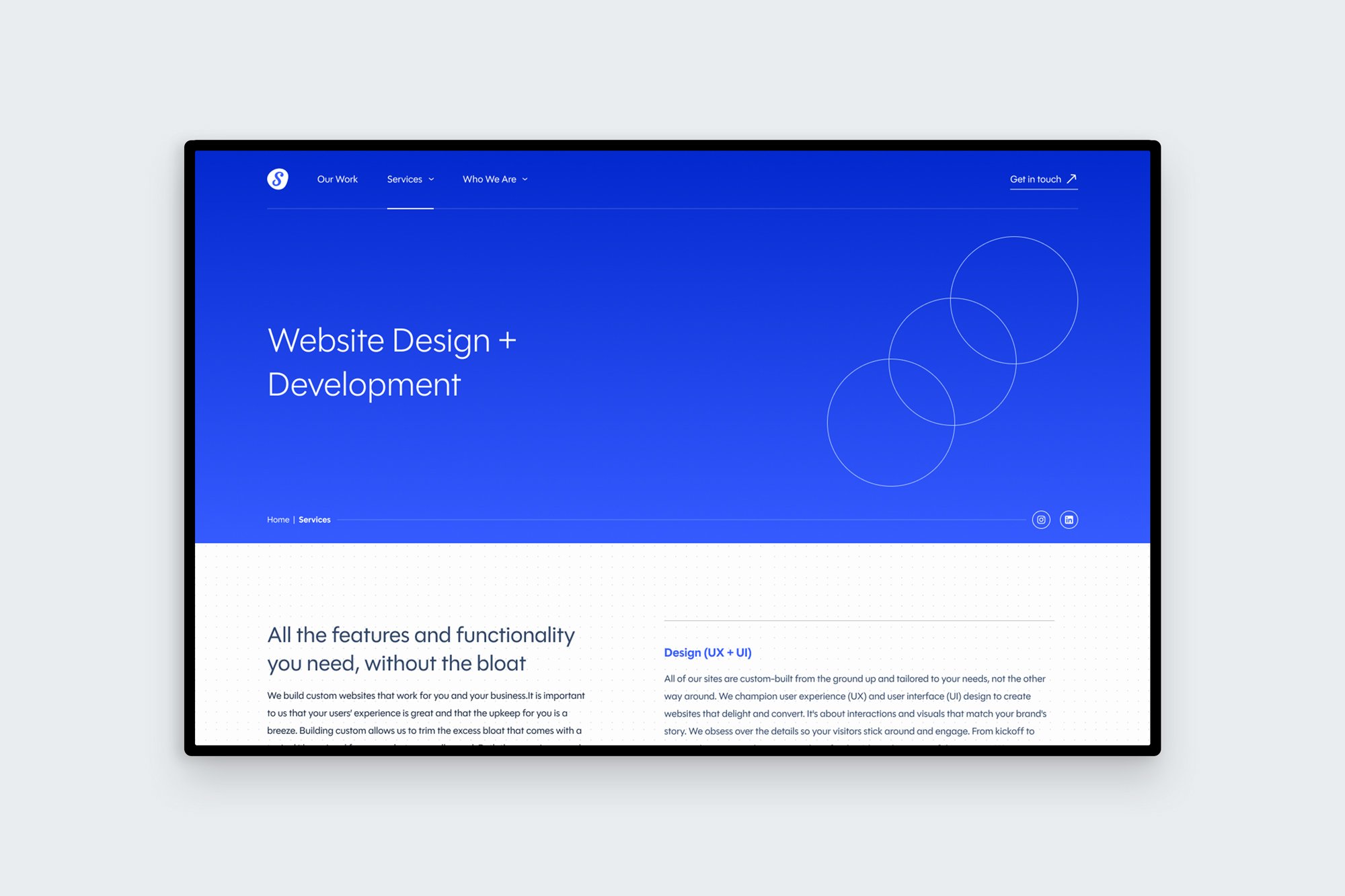
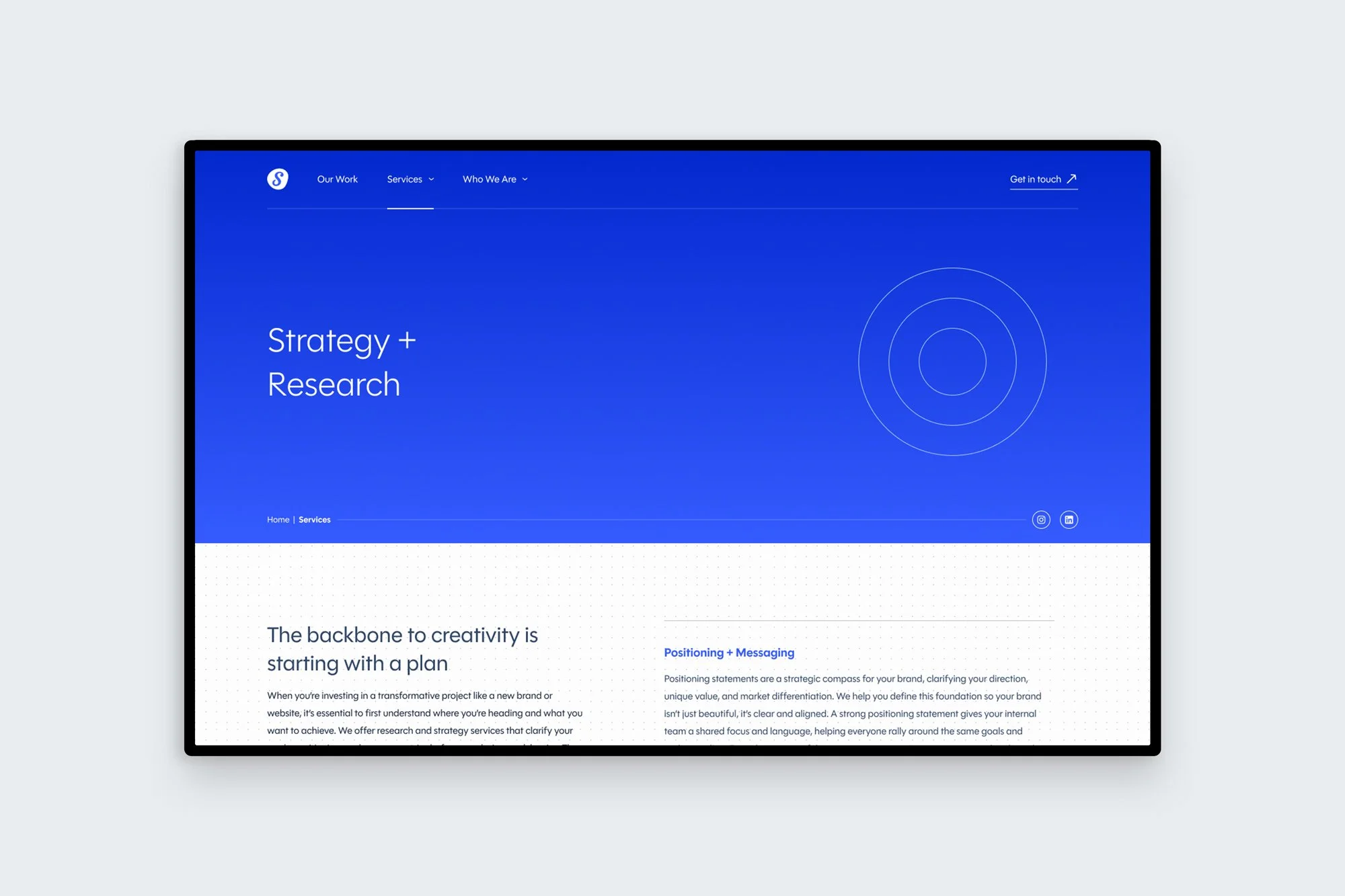
Services pages: High-level service offerings each got their own page on the site, that outlined in greater detail the offerings and expertise of the studio.
Extending the visual language into motion
Distinctly framing each core pillar of the business, I created icons and animations that represent each of the high-level services areas. They’re easy to recognize symbols and an element of visual interest to add depth and motion to the brand.
The intent was to expand the brand’s visual language and offer new tools to be used beyond the website such as posts, ads, and presentations. All of which could benefit from different uses of the icons and animations to level-up sales efforts.


Digital Marketing
Branding


Website Design + Development
Strategy + Research
Each of the core service pages follow a system, making it easy to navigate and understand the information. The focus of the page is the content, allowing the offerings to be clear and the tone direct. Each service page was supported with relevant case studies below to add the visual punch.
Insights
We needed to strike a balance of showing and telling.
To-the-point service offerings with descriptions that avoided design and marketing jargon were championed across the website. This helps lower the barrier to entry for potential new clients who are searching for help and support in these areas (and are not design experts themselves).
However, we found this was best supported with visuals to back up the claims. People want to see what they are getting. It was important to have connected content across the site, leading visitors between case-studies and service offerings to get the whole picture.
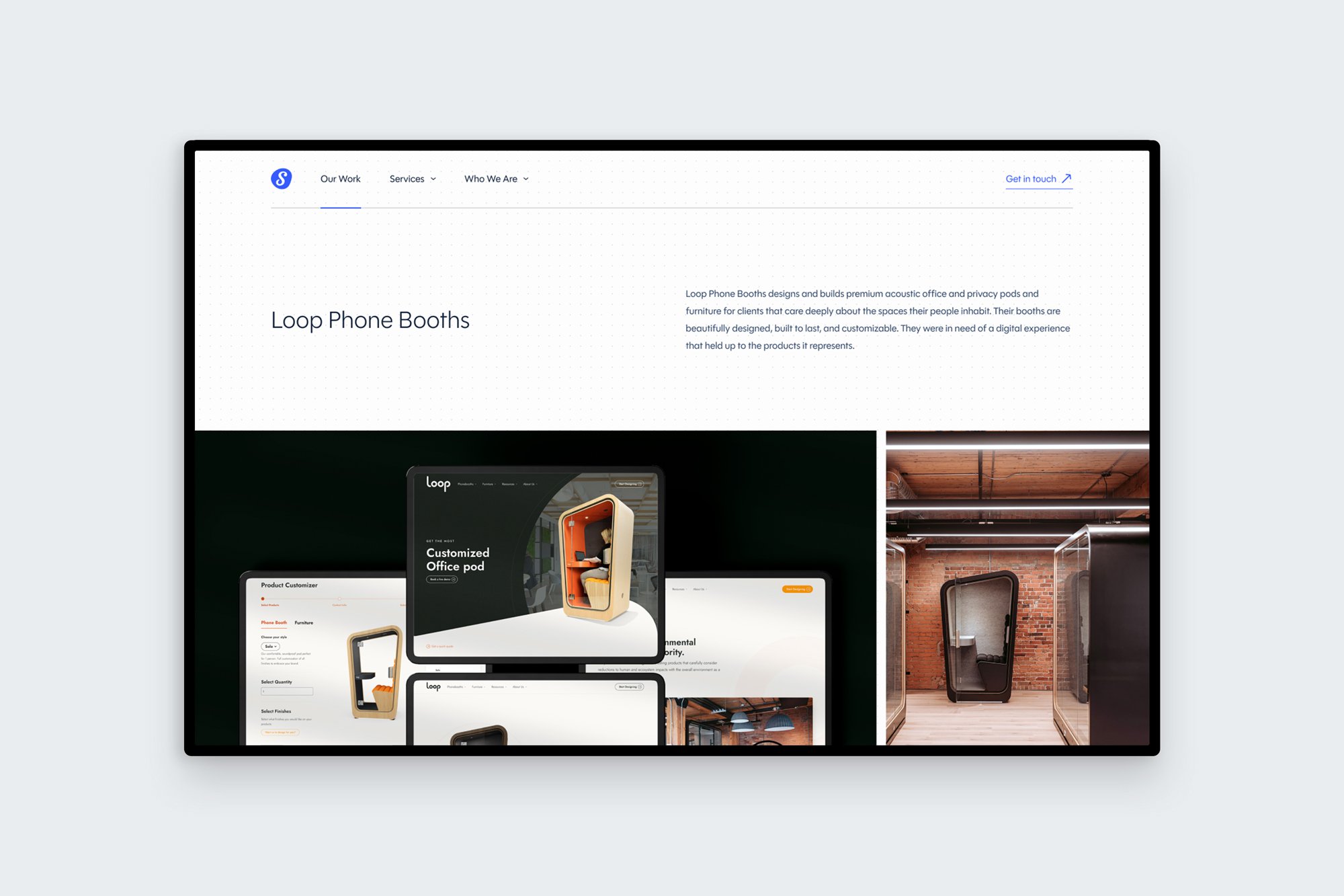
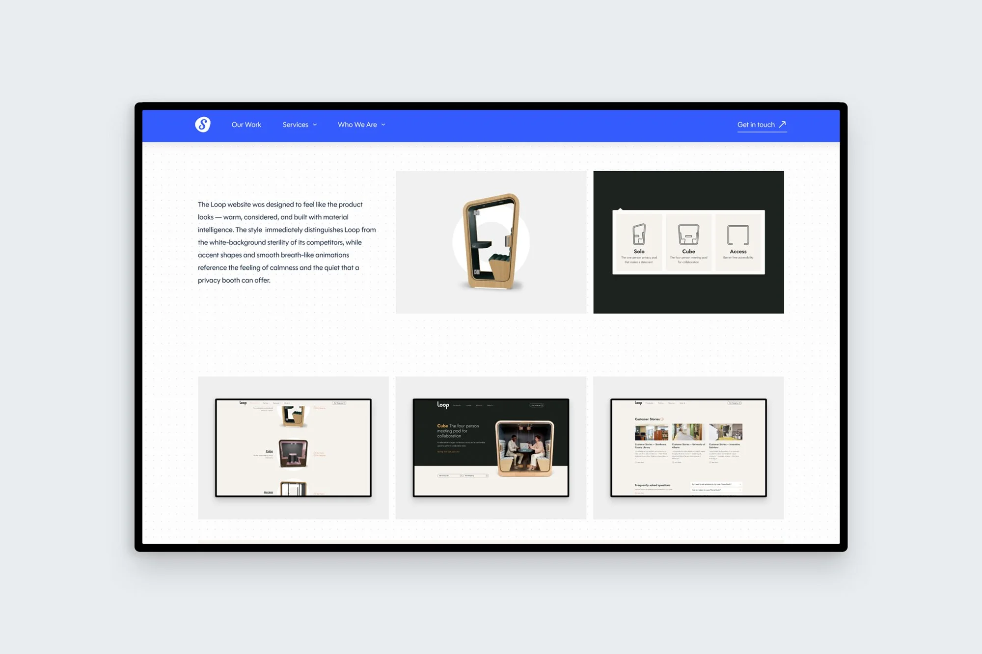
Designing a system for case studies and portfolio pieces. Each project is unique and can vary in scope and size. This required a system for how the company would present work on it’s website that could be easily replicable. Consistency and ease for team members to upload new work is important – keeping the studio up-to-date (even in busy seasons).
Results
A design system built for the whole team to use
The results are not only UI and UX that feels representational of the work the studio outputs, but it also becomes a tool for various team members to use. Founders can use the case studies for sales and the visual language in presentation tools. Directors and team members can contribute to marketing and communications efforts having a brand style and assets to utilize. Overall, the approach is more modern, includes motion, and really highlights services in a clear way – maturing the outward appearance of the studio to match the incredible work they produce.
A mature tone, but still including features that de(light)
Being personable and fun aren’t opposites to being professional experts. A balance was struck between the clean and minimal aesthetic of the website and digital experience and interactions to help evoke small moments of delight. Along with an inviting and friendly tone of voice, the visual aspect of the brand is also communicating through its UI and UX elements.
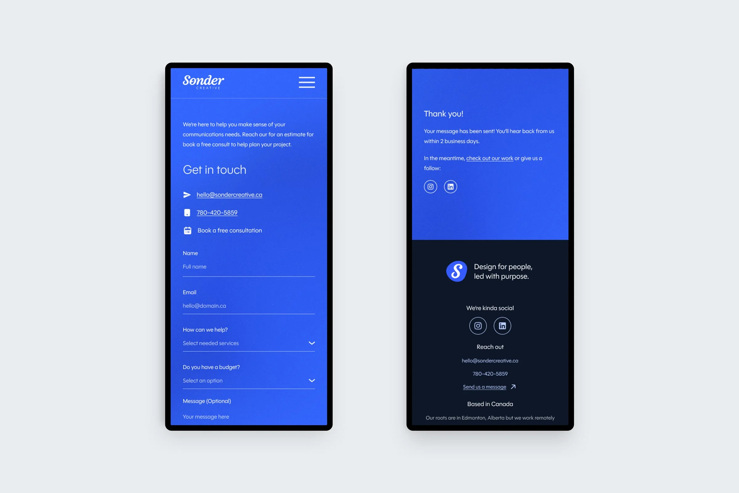
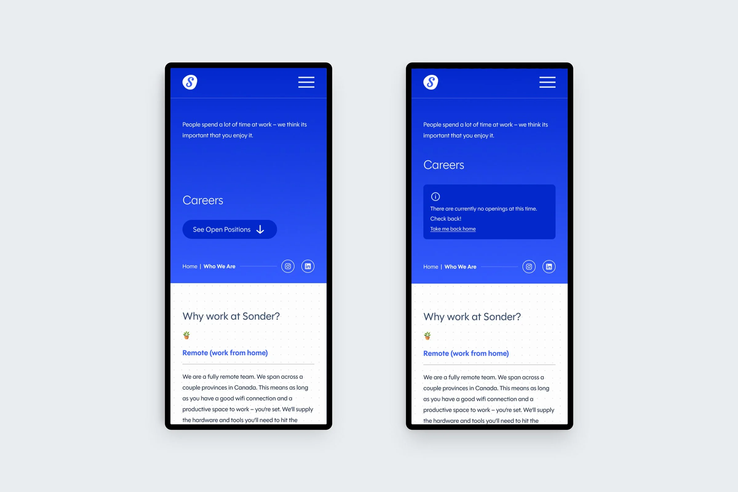
Tools for the business were designed into the website, including contact forms that helped identify scope of work and budget in advance of a Zoom consultation. Career postings and application intake was another helpful feature. This needed to be planned for two states, when positions are available and when no jobs are currently posted. These details make the website support workflows within the business.