From sketch to video game, bringing kids’ imaginations to life
Project Background
Sketch n' Play is an educational platform and game that lets kids design their own video game levels on paper using markers and stickers. With a snap of a photo, it converts their drawings into playable games on any browser-connected device. It's part physical creation and connection, part game engine, and entirely the kind of thing kids want to do! We centred the brand around lifting up kids as creators and encouraging their imaginations.
*This project was done at Sonder Creative.
Project Scope
Brand and Visual Identity System
Website Design (UI + UX)
Wordpress Development
Graphics for Launch Campaign
My Contributions
Creative Direction and Lead Designer
Brand, Logo, and Visual Identity System
Graphics for Kickstarter Campaign
Animated Visuals
Opportunity
Sketch n' Play arrived with something rare – a genuinely novel concept.
The brand challenge was to create a visual identity and digital experience that could do justice to the product. It needed to be exciting to kids, trustworthy to parents, and compelling enough to convert curious visitors into backers.
The founder came to us with a working prototype, a great idea, and was in need of a launch strategy. Our job was to give Sketch n' Play a brand and a website and initial account experience to connect with the kids and parents who would be using it. Since it was still in beta, this meant dreaming up all the imagery, testing the product, and creating the all the visuals that are helping bring it to life.
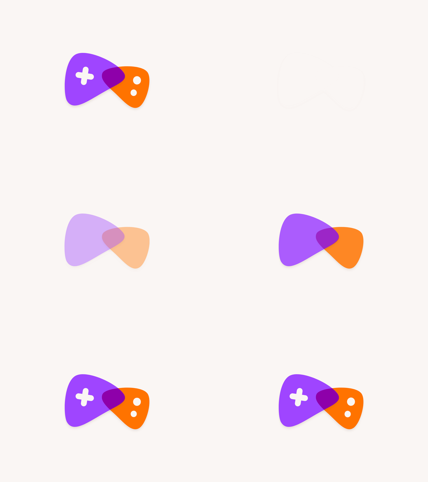
The logo and visual identity are playful and imaginative. The mark brings together basic shapes (triangles, circles, and a plus ) which are all commonly found on game controllers such as action buttons and d-pads. These shapes all together represent a stylized controller. The curved edges and slightly varying sizes help communicate the “sketch” aspect of the brand, championing the imperfect and highlighting the “idea” stage.
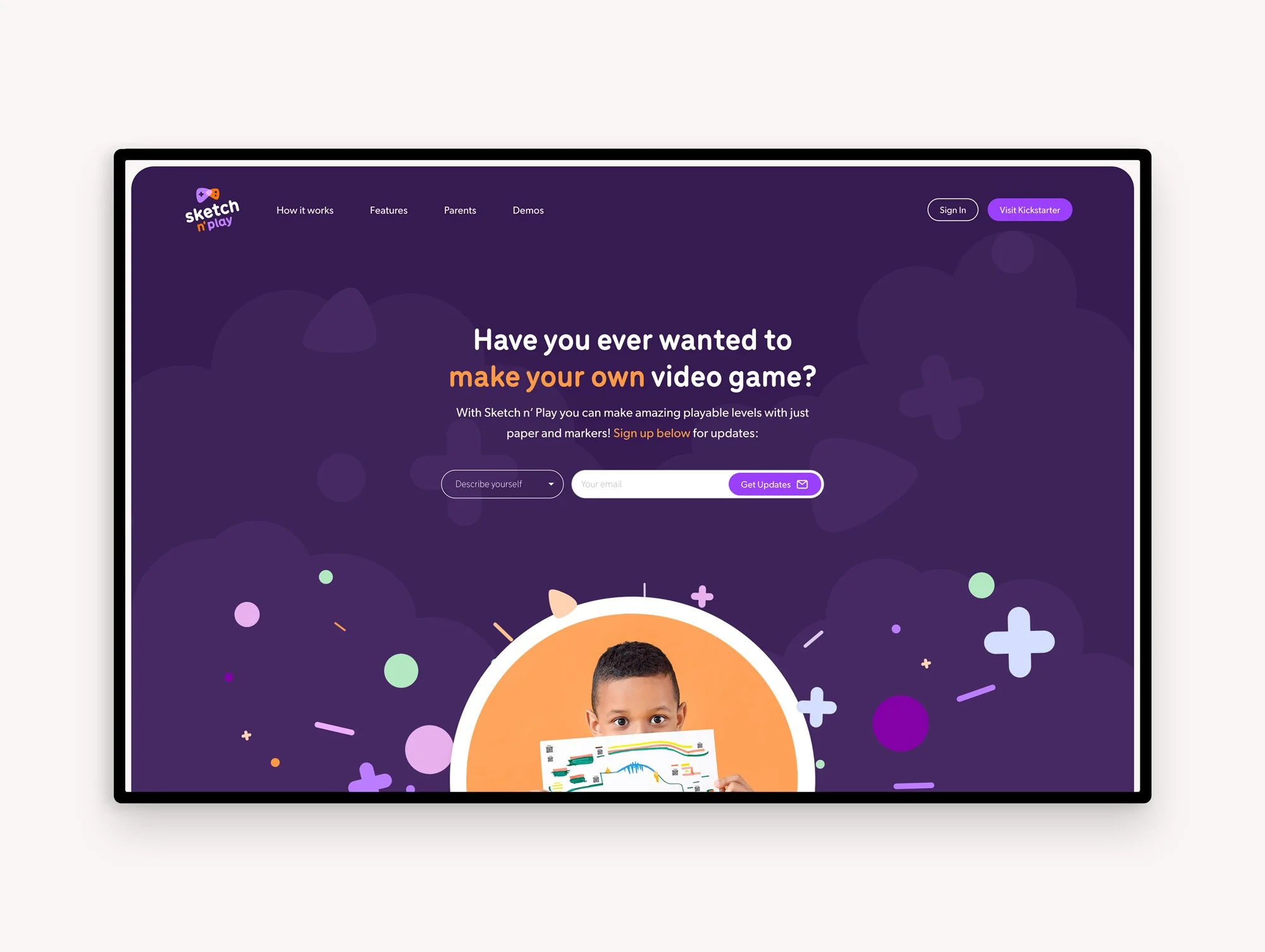
Fun as visual style: The product shouldn’t feel like homework. Words like delight, wonder, and cool came up in the discovery phase and are what the visual direction leaned into. *The website was designed by a coworker at Sonder Creative.
Insights: What we heard from kids and parents
“I get to MAKE my own game and then play it. Normally other games are already made.”
Kids want to make the thing they play and they told us exactly that. When we asked kids what they liked about the demo, the answer was "I get to MAKE my own game and then play it. Normally other games are already made." This moves kids from being a consumer to a creator which became the emotional core of Sketch n' Play’s brand voice and visual direction.
When we asked kids and parents what the word "sketch" made them think of, the responses relayed quick, rough drawings and the concepts of pencil and imagination; "easy to make, it doesn't have to be perfect." The concept of not needing to be an artist is an important insight. The brand leaned into this, using imperfect shapes, hand-drawn elements, and playful visual language to reinforce that the product welcomes all skill levels.
Parents identified "so many games have low replay value" as a frustration. It ends up being wasted money if it never gets used again. Sketch n' Play can literally grow with the child. It offers the ability to keep creating new levels, the sticker packs allow for expansion, and the idea of collaboration and connecting your friends’ ideas with yours means infinite creative longevity. The brand needed to communicate this aspect of imagination and flexibility to demonstrate its longevity to parents.
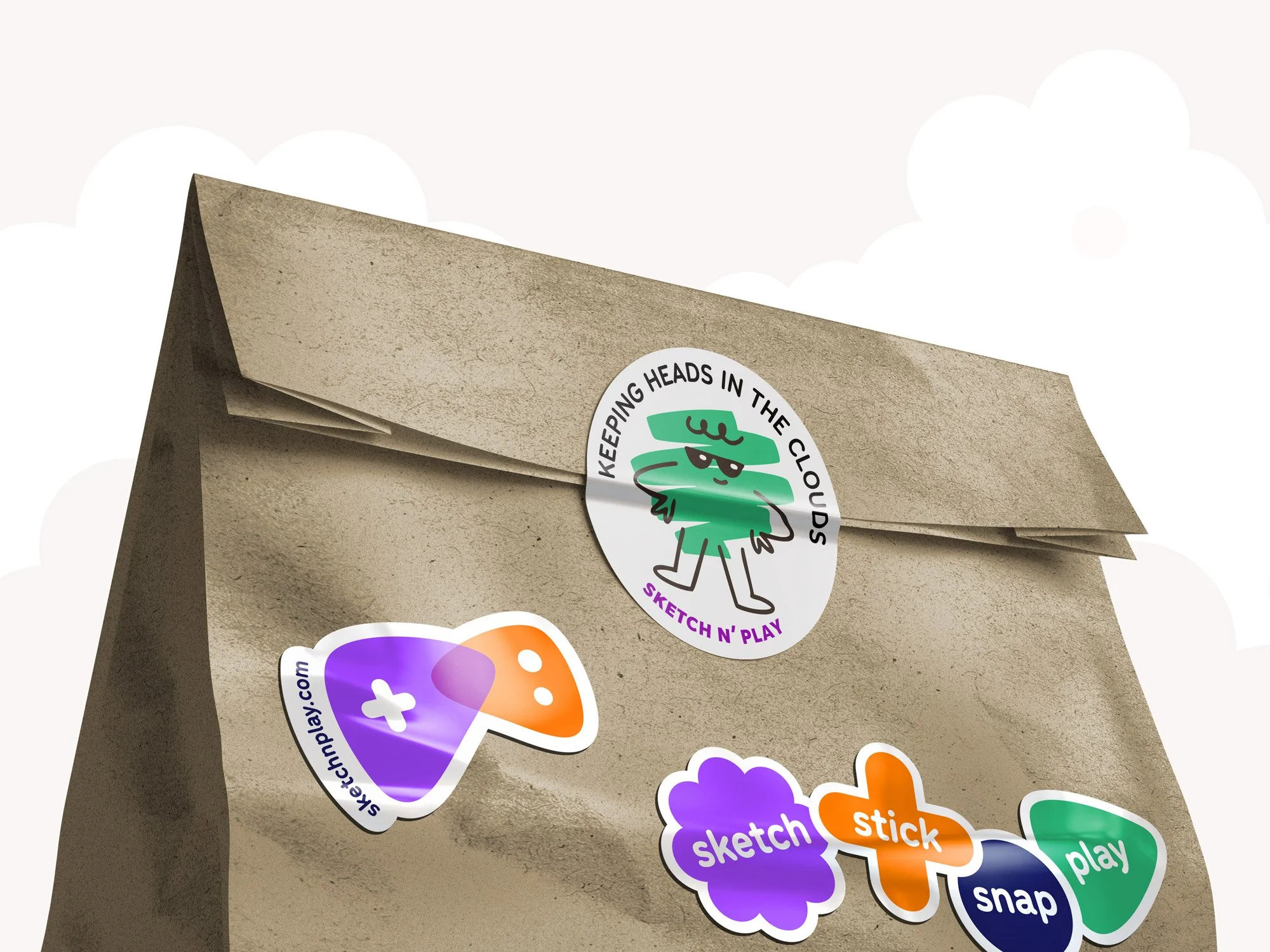
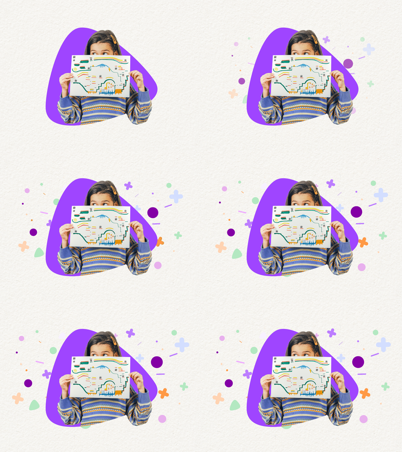
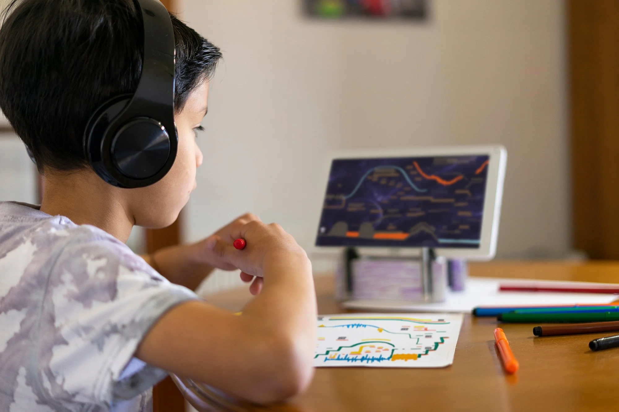
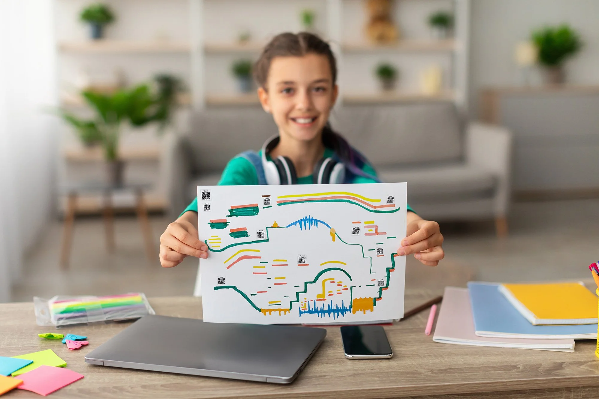
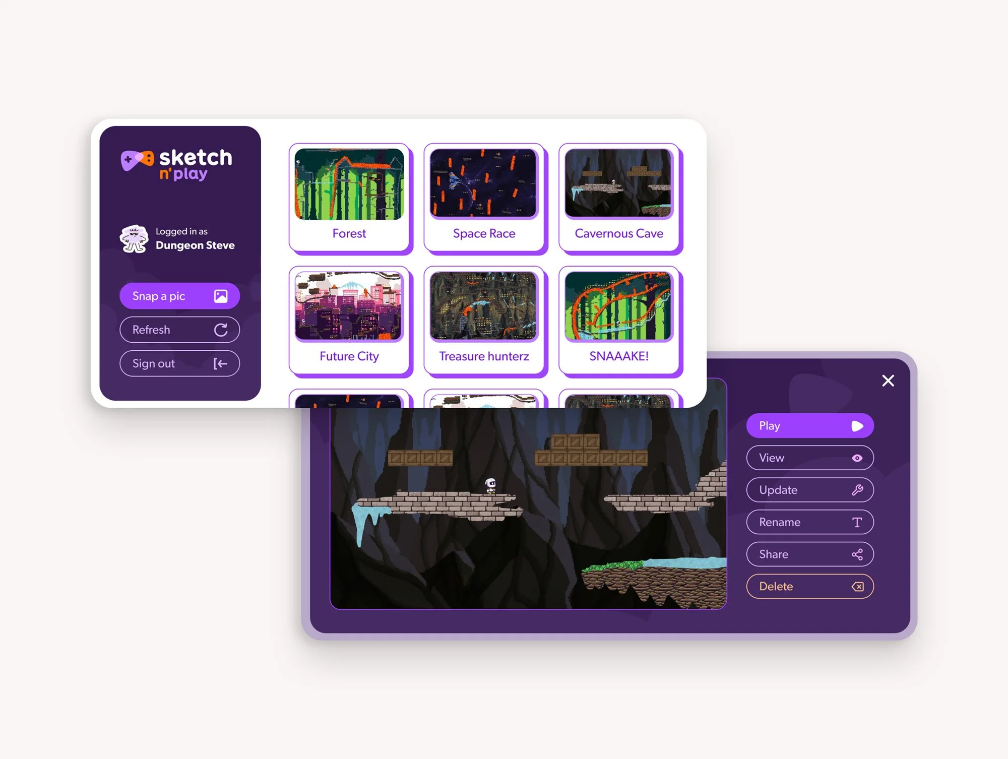
Bold, playful, and built for delight. The visual identity is as energetic as the product it represents. The "you made this" angle is the emotional core for kids. For parents, it's "creative play that lasts." They're the same product promise told to two different audiences.
Insights
The product needed to communicate it’s complexity of being more than a game while at the same time feeling easy to jump in.
The in-person play, potential for collaboration between friends and family, and physical creation of drawing all differentiate Sketch n’ Play from any other forms of video-game related products for kids. It’s putting imagination and development before screen time. It also has a facet of being able to help teach game development to older kids and branch off as an education tool. These nuances still need to be communicated to express the full value, but in a way that is easy to digest.
It also required appealing to two very different audiences. Parents write the cheque. Kids decide if the product gets used. The brand needs to speak to both by communicating educational value, championing in-person and physical collaboration and play, and screen-time legitimacy to parents, all while being genuinely exciting and delightful to kids.
We recognized the set up process has potential to be a barrier. The brand needed to explain a complex product simply. Using Sketch n’ Play should feel obvious and accessible in the very first moments of exposure. This is important to give kids the feeling of autonomy and alleviating parents from complicated set up that might deter both them and their children from actually getting into the game. There is often little to no patience for failure, complicated setup, or delayed gratification. This became a non-negotiable design constraint even for the digital experience. The site needed to reflect how the product can be as easy as “sketch, stick, snap, and play.”
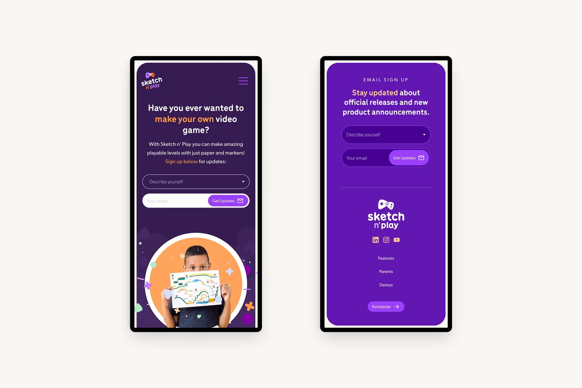
Building excitement: With Sketch n’ Play being new to the market, this first version of the website needed the primary call-to-action to be about building anticipation and getting sign-ups for launch.
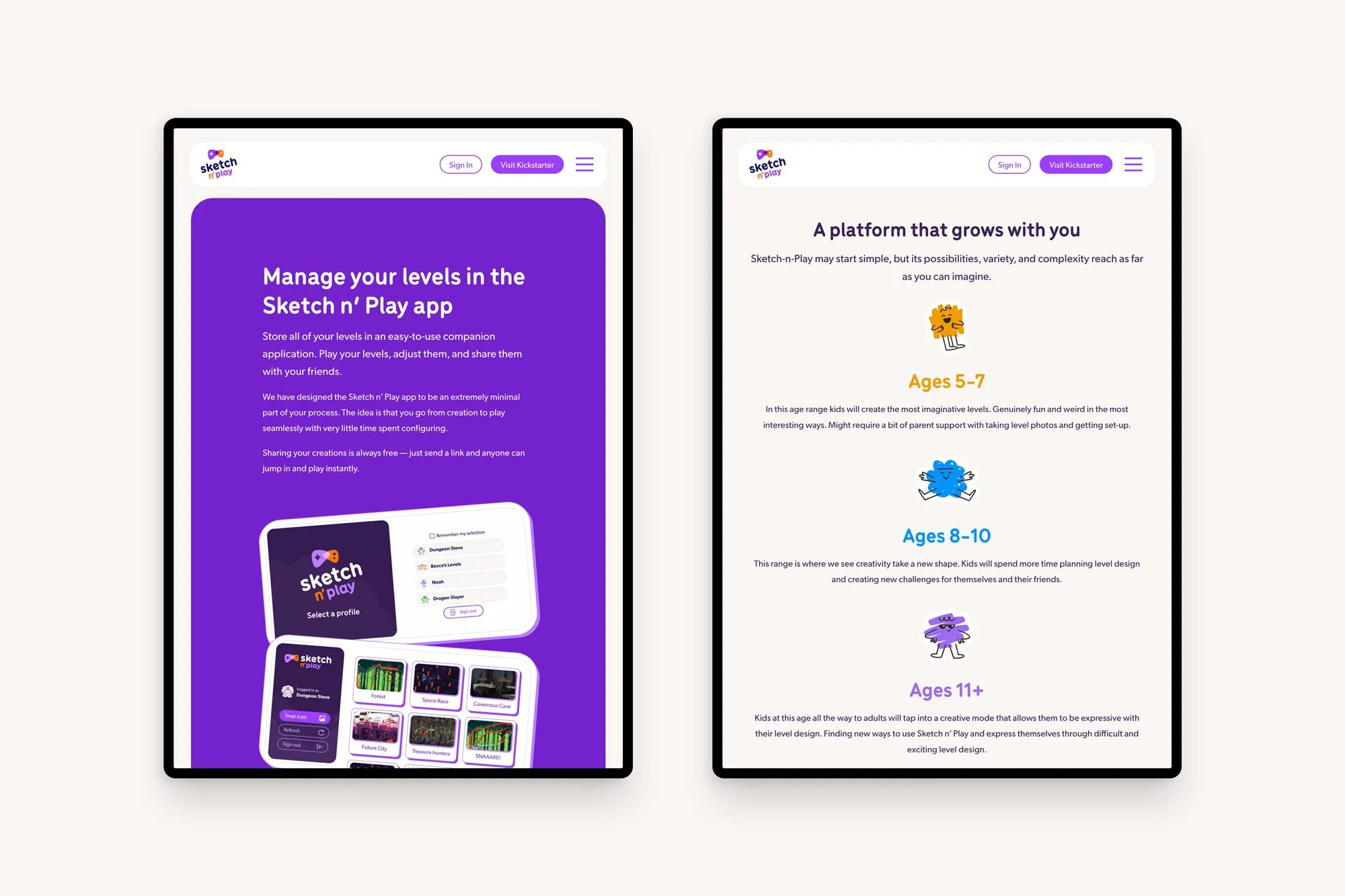
Age framing: Parents explicitly called out that games are often pitched at the wrong age. Positioning Sketch n’ Play as multi-age and collaborative (siblings, friends, parent-child) addresses a real pain point.
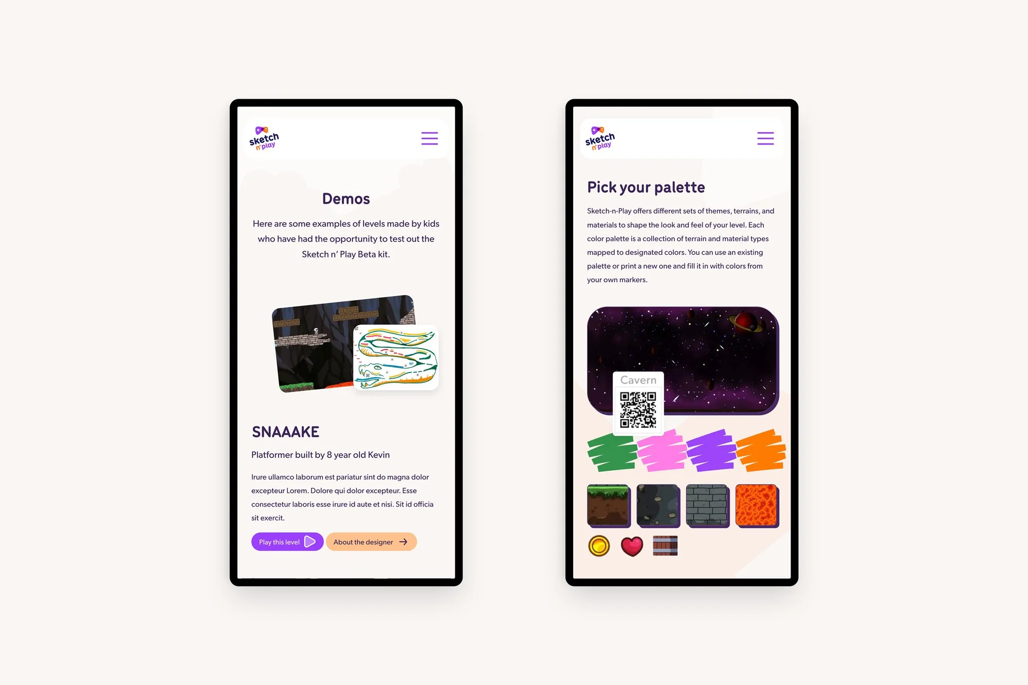
Kids are drawn to agency and ownership: The ability to make something that's theirs and then play it is the core hook. It was important to showcase demos and just show customized the levels can be.
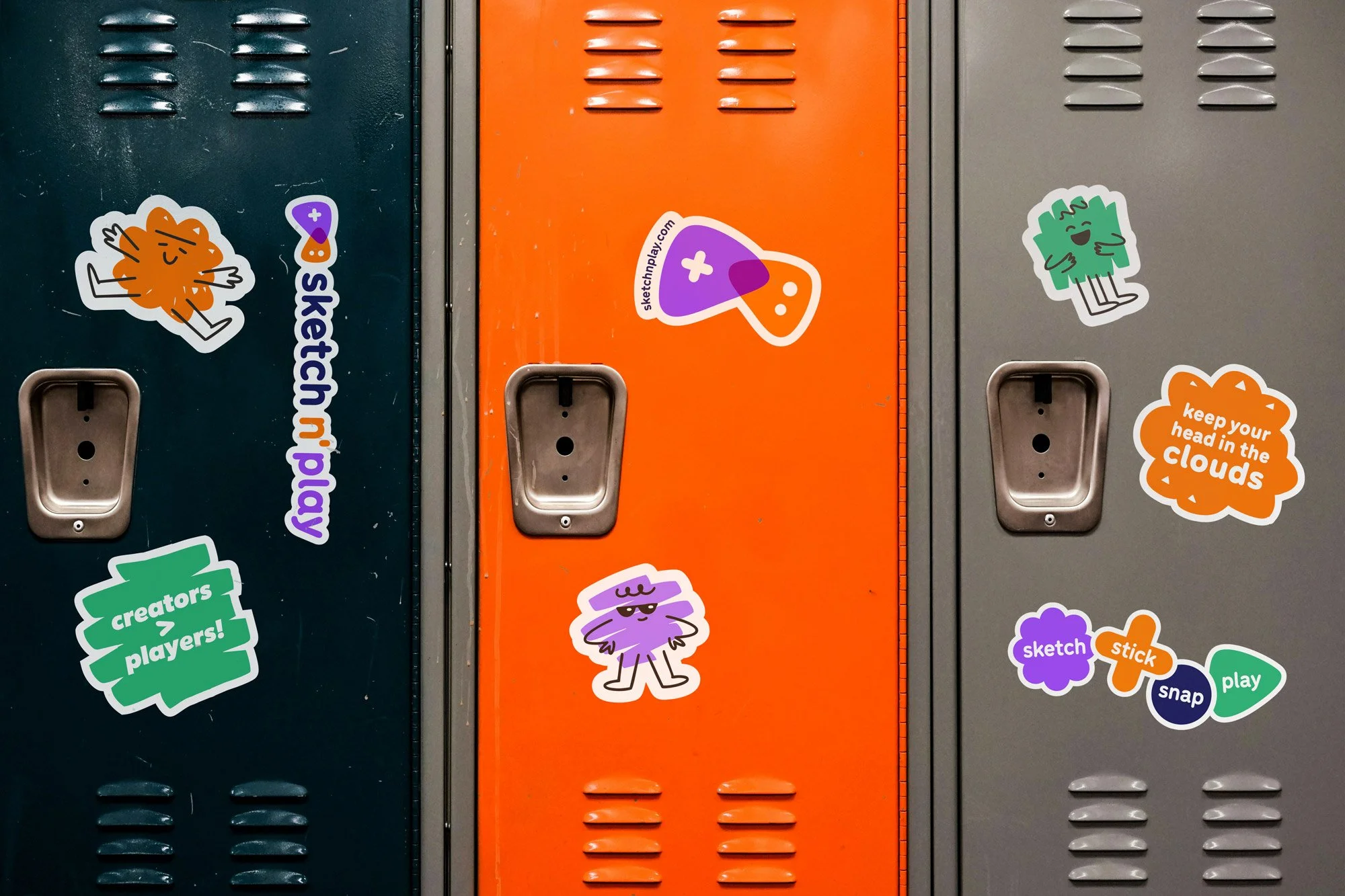
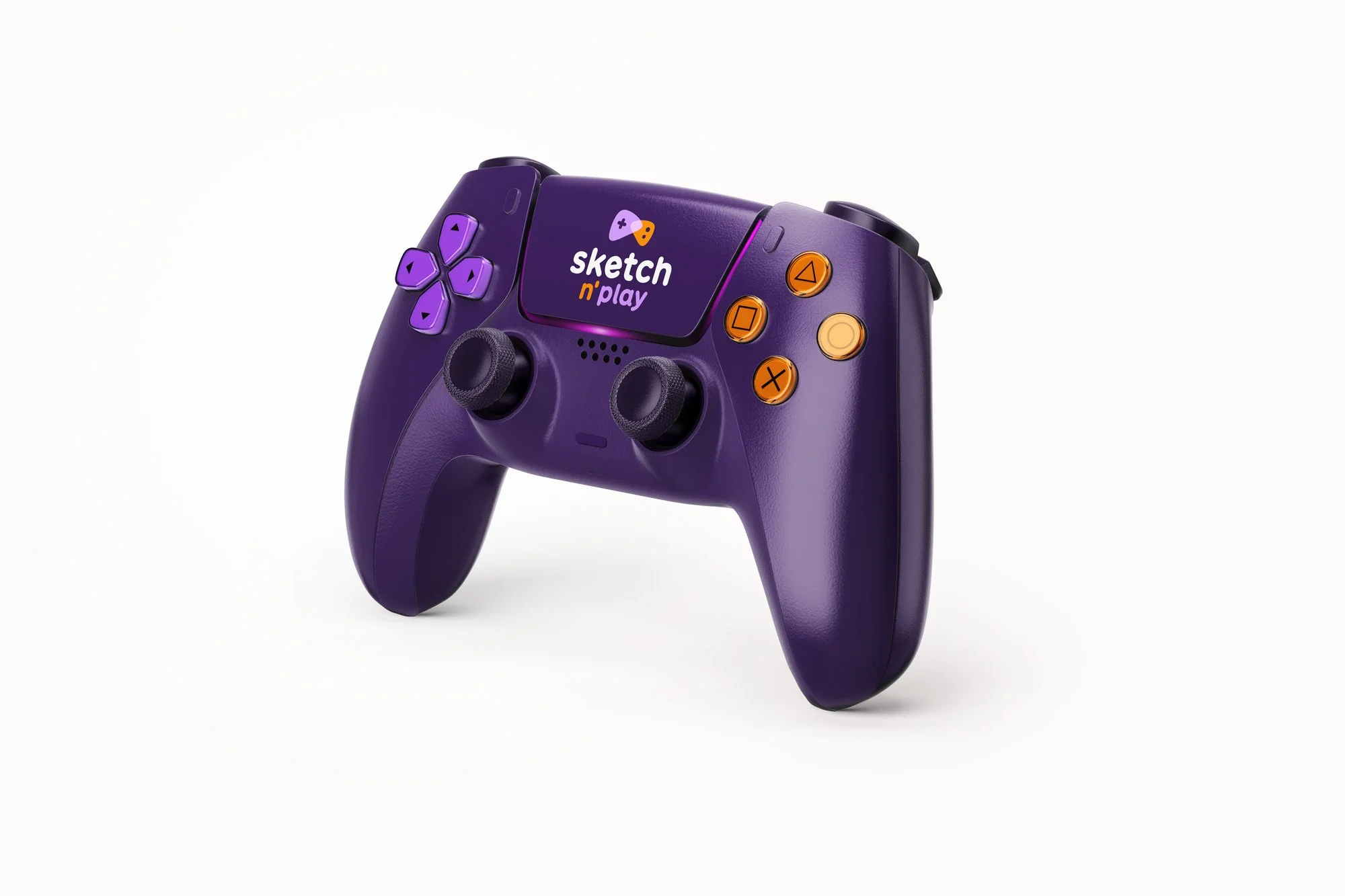

Visual language: "Sketch" signals quick, low-stakes, imperfect drawing. The brand visuals should feel handmade and energetic, not polished or corporate. The style champions imagination.

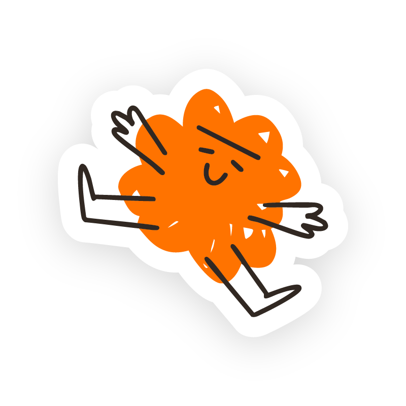
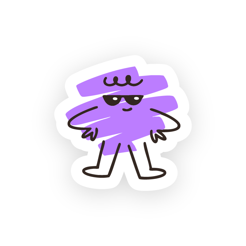
Sketch characters: Part of the brand graphics included characters that are sketches themselves. They are another visual tool to help relay physical creation, express emotion, and add some personalization for accounts and users profiles.
Stickers: Part of the physical kits is including stickers on the drawn levels to signal level type, special effects, and character once the image is uploaded online. We brought this tactile concept of stickers into the visual language.
Results
The result is a brand worthy of a product that might genuinely change how kids think about games, creativity, and what it means to make something.
The visual system is bold and built to delight. Sketch n’ Play’s identity is energetic and playful without sacrificing the visual quality that parents expect. It draws on physical aspects of play and represents craft and imagination while still upholding a clean UI that feels current, relevant, and inviting. The typography is chosen for its delight and readability. It works for both parent-facing and kid-facing content and game UI contexts.
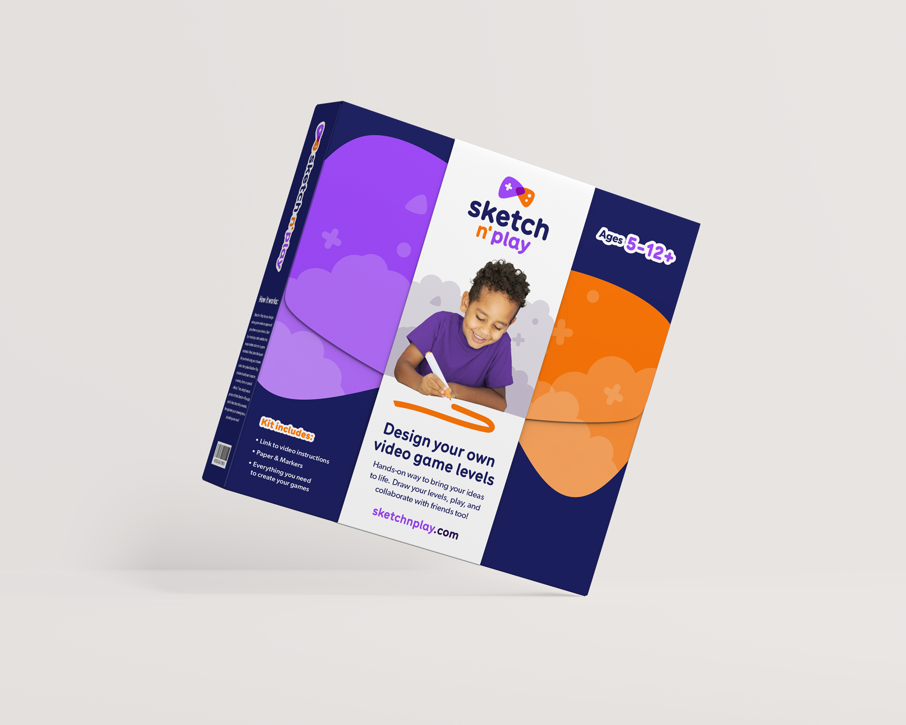
The visual system can be used across packaging concepts, digital applications, and crowdfunding materials. It presents Sketch n' Play as simple to start and limitless to explore. It’s a product that a 5 year old and a 10 year old can genuinely enjoy at the same time, at completely different levels of complexity.
The website was designed to deliver the payoff immediately. Sample games are shown early, the physical-to-digital flow is demonstrated visually, and the email capture appears multiple times so there are no barriers to staying up to date on launch and features.
Overall, Sketch n’ Play has a cohesive launch kit. It’s ready for investors, social media rollout, and eventual physical product packaging as the product grows from prototype to market.